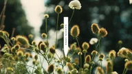
It is a little known fact that a small garden grows high above Piccadilly at the top of the renowned Fortnum & Mason building. Inspired by this hidden nursery, Fortnum & Mason created a new bath and body range with sustainability and wellbeing at its core. We were asked to bring this verdant range to life, from story and naming to packaging design. Staying true to their heritage assets, while achieving a more contemporary and universal appeal.
Fortnum & Mason

A modern composition for a heritage brand.
Sector
- Beauty
Deliverables
- Naming
- Brand Voice
- Packaging Design
- Copywriting
- Art Direction
Challenge & Impact+
Cultural Purpose+
To create a modern composition for a heritage brand, we had the idea of a garden being like an orchestra. A Garden Song expresses a distinctive and harmonious natural composition. Products are thought of herbaceous chords, with high and low notes that can carry you away.
Brand Ecosystem+
We created a world of vibrant, blooming colours and lyrical descriptions referencing the garden. Each element across voice and design brings freshness and modernity to the brand's equity. We introduced white and fluro colour alongside the iconic Eau De Nil blue, and transposed their infamous tins and caddies in food into infinitely recyclable aluminium bottles in beauty. On pack, these elements sing joyfully together with layered storytelling, hitting an engaging, sustainable and harmonious tone befitting bath time rituals.


GARDEN SONG
Playing on the idea that a garden is like an orchestra, we paired a harmonious colour palette with rhythmic product descriptions and a lyrical name, Garden Song. Working closely with illustrator Mia Carameros, we carefully applied botanical sketches across each product to let the range truly flourish. The illustrations are also engraved and picked out in gold leaf onto the ceramic candles for a little added luxury.


