Words
Katy Pryer
Stories
Bring Back The Boozer
– a rallying cry for revivalsAs Brits, we have a particular love for the pub that eclipses everything else. A place so culturally and historically significant to us, it’s hard to imagine our lives without it. A place of first dates, weddings, and wakes, of tall tales, great grub, and “usuals”. It goes deeper than just loving a pint, but that doesn’t hurt. After all, booze runs thicker than water.
Pubs have united our kingdom’s communities for centuries, the first truly egalitarian space where men and women could mix, and people from all walks of life could rub shoulders. Pubs are the great leveller. Where else would a knight, a miller, and a priest find themselves sharing a Canterbury Tale or two, if not such a neutral and democratic space?
It was also the first industry where women could generate their own income as business owners, setting the bar for Barbara Windsor and #girlbosses everywhere, no pun intended. In Medieval times, beer brewing was women’s work, and everyone and their mother was at it. Housewives began selling their extra bit of bitters, opening their homes to the public who would flock, tankards in tow. The best brewers (and probably the comeliest barmaids) attracted a larger crowd of loyal patrons. And lo, the local was born.
Like the endless rings of beer absorbed into tabletops, pubs have seeped into every corner of culture. Without pubs, there’d be no going “to the Winchester, to wait for all this to blow over”. No morbid tourists Ripper Tours. And what of Star War’s Iconic Cantina scene, if not to hold up a mirror to the old timey tavern?
They’ve changed the way we eat, too, from early days of welks and pig trotters, to the 20th century skyrocket of scotch eggs and the humble pork scratching. Even the toastie is a snack supposedly spearheaded by pub patrons – impaling layers of cheese and bread on spikes and thrusting them into the fireplace. In short – pubs are British culture. Let’s hope we are never without them.
But in recent times, we’ve come incredibly close. Already in steady decline – according to the study by real estate analysts Altus Group, boozers are shutting their doors at alarming speeds across the country. With a total of 383 pubs closed across the UK during the first six months of the year. As a result, communities are a little less merry and a lot less connected.
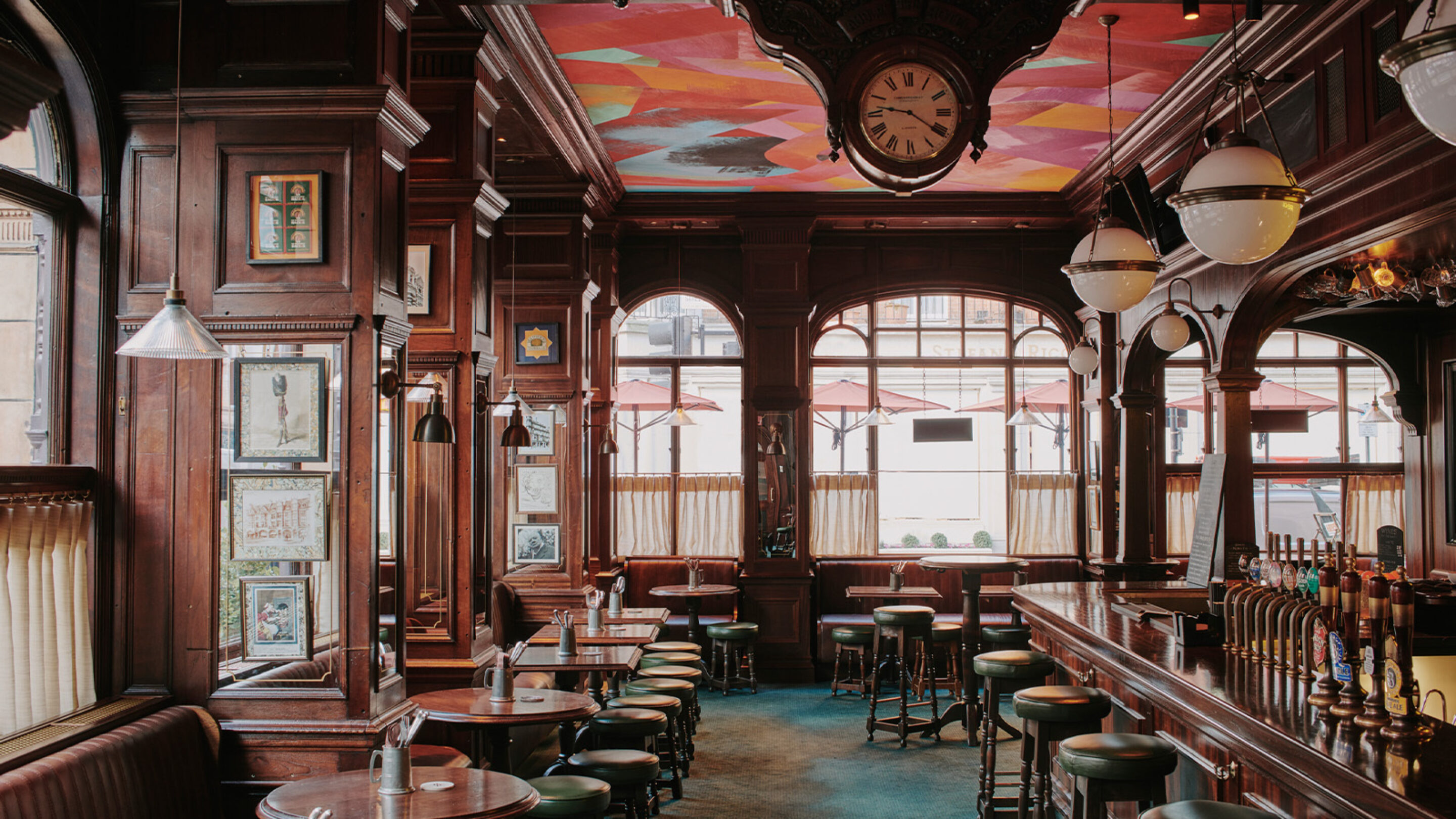
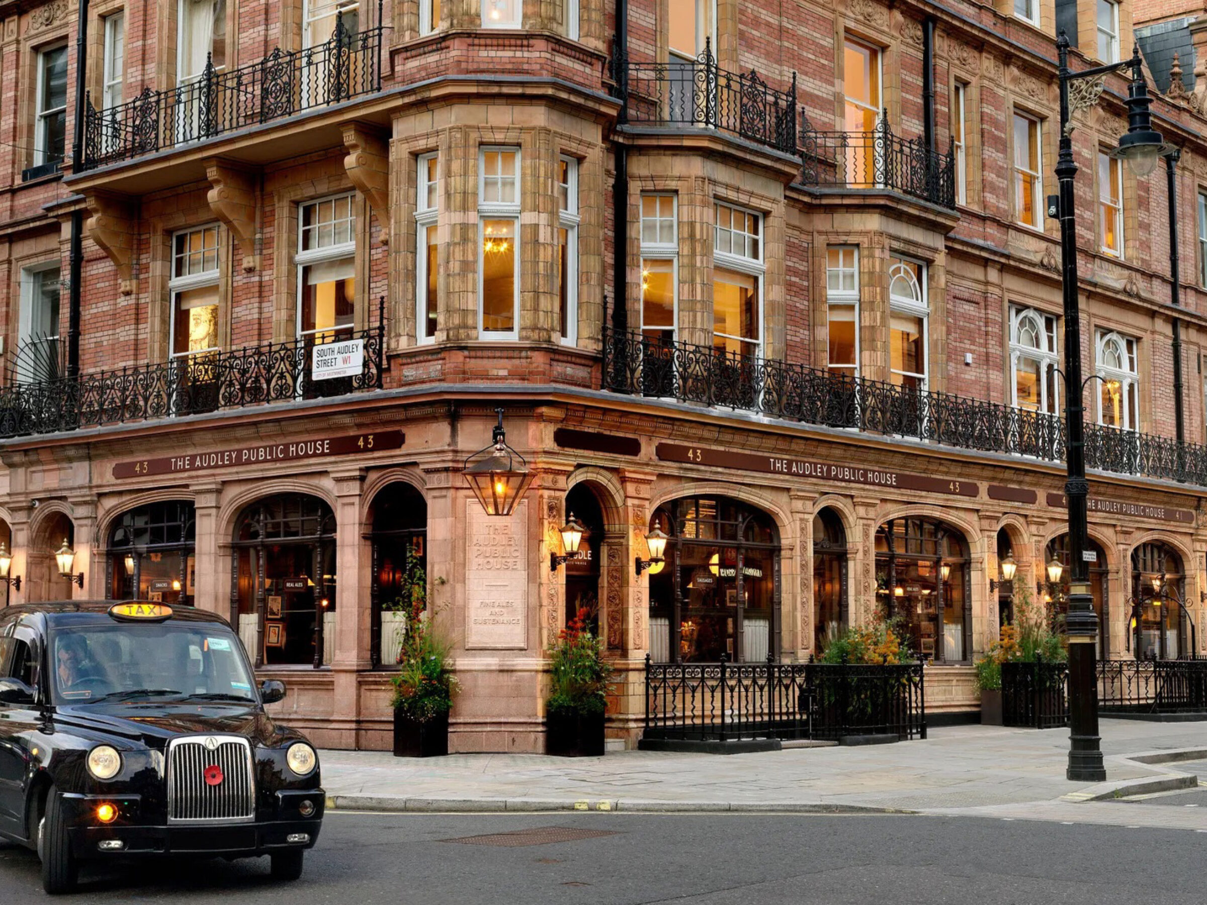
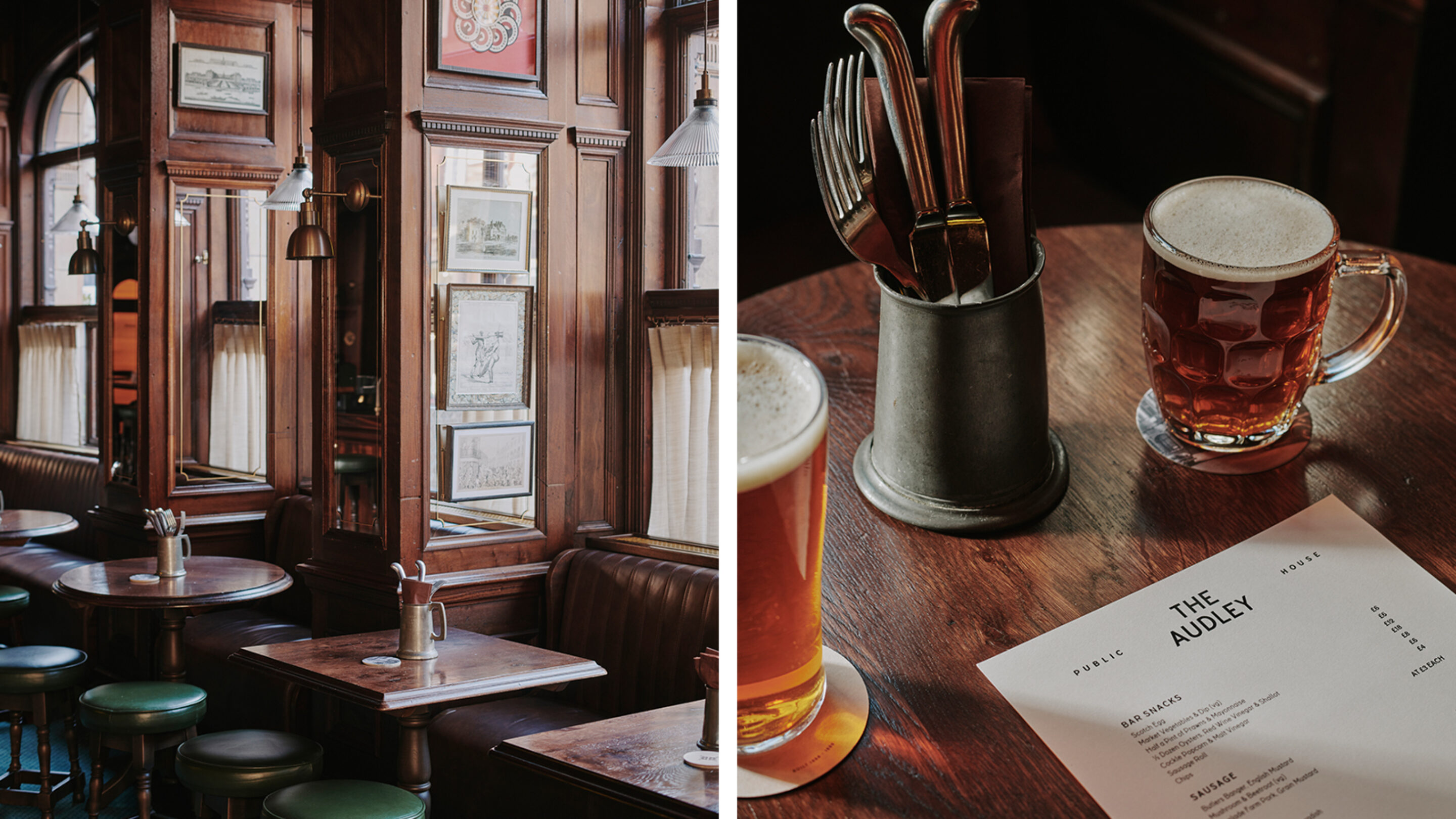
Standing proudly on Mount Street since 1888, The Audley is just such an integral icon. West end watering hole of both Mayfair’s service workers and its ruling classes; The Audley has been a lone island of equality in a sea of exclusivity since its arrival over 130 years ago. Even the Obamas headed to this Good Old Pub to enjoy a proper plate of fish and chips back in 2009. When it closed in 2019, Hauser and Wirth saw the opportunity to return this Mayfair Institution to its original splendour.
A meaty project like this is any agency’s dream, one entrusted to us in early 2022. Hauser and Wirth are no stranger to identifying significant establishments at the heart of their communities and returning them to their former glory. Marking their first partnership with us, in 2018 they turned their attentions to The Fife Arms, an ancient Victorian coaching inn nestled in the heart of the Highlands.
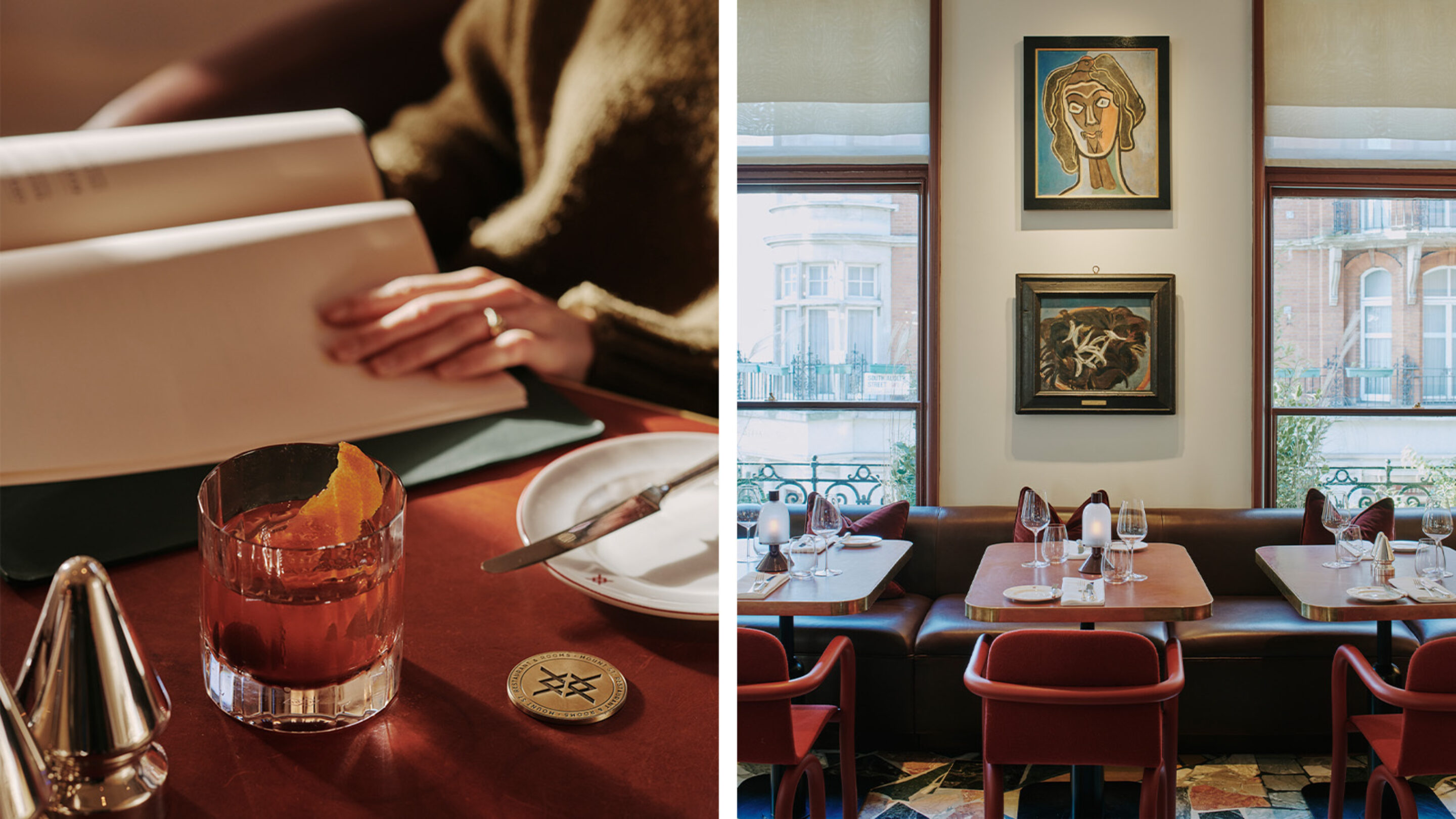
Both The Audley and The Fife Arms offer that rare and beautiful opportunity to have a tangible effect on culture – to break through the design world into the real world. Because preserving these unique old pubs and inns doesn’t just give back to the immediate communities and locals around them. It also has a knock-on effect, bringing fame and fortune to beautiful areas of the world, the vibrant hubs of Braemar, and beyond – and we’ll raise a glass to that. But most importantly, it acts as a clarion call, a hope of rallying others into similar revivals, reversing the decline of this great British institution, one that we simply can’t afford to lose.
Because on this small island of growing divisions, there’s one thing that truly unites us. Not the politics that we align ourselves with, or what name we give to a bread roll. No, it’s our love for and affinity with the pub. They’ve filled our bellies, our boots, and our souls, survived lock ins, lockdowns, and the rest. Next time you pop down to your lovely old local, pause a moment to take in the chorus of community, scan the faces of each punter, raise your eyes to the ancient eves, and you’ll find it - the beating heart of Britain.
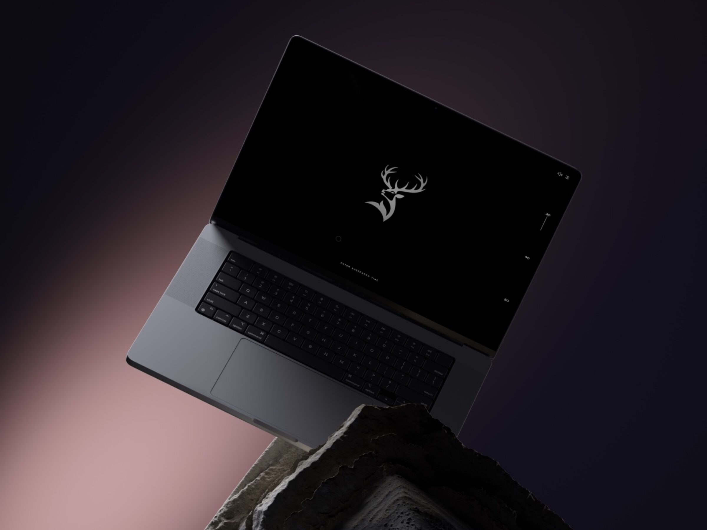
Luxury's Waltz With Technology
— creating experiences to transcend the mundaneWords
Matt Nicholson
When light moves across an object, you can feel it. The materiality, the texture, the quality. It’s the movement that matters, it helps us read the surface. Understand the object. It's a dance of photons and surfaces that speaks to a fundamental human instinct — the desire to touch, to explore, to engage with the world around us. In the realm of luxury, where products transcend the utilitarian and metamorphose into symbols of desire and status, this interplay of sensation takes on an even more pivotal role.
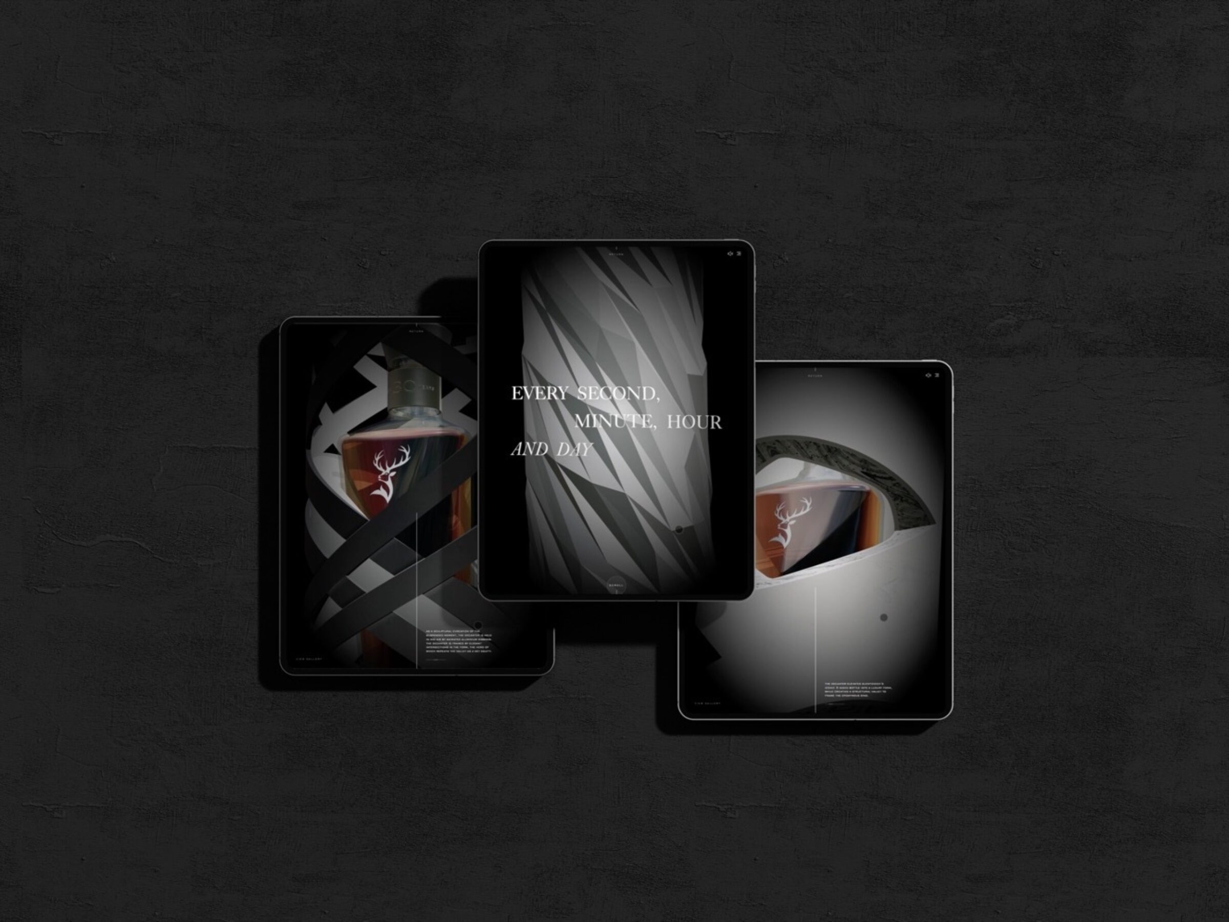
Our interactive case study for Glenfiddich explores how luxury brands can create experiences through which products are not just seen, but felt.
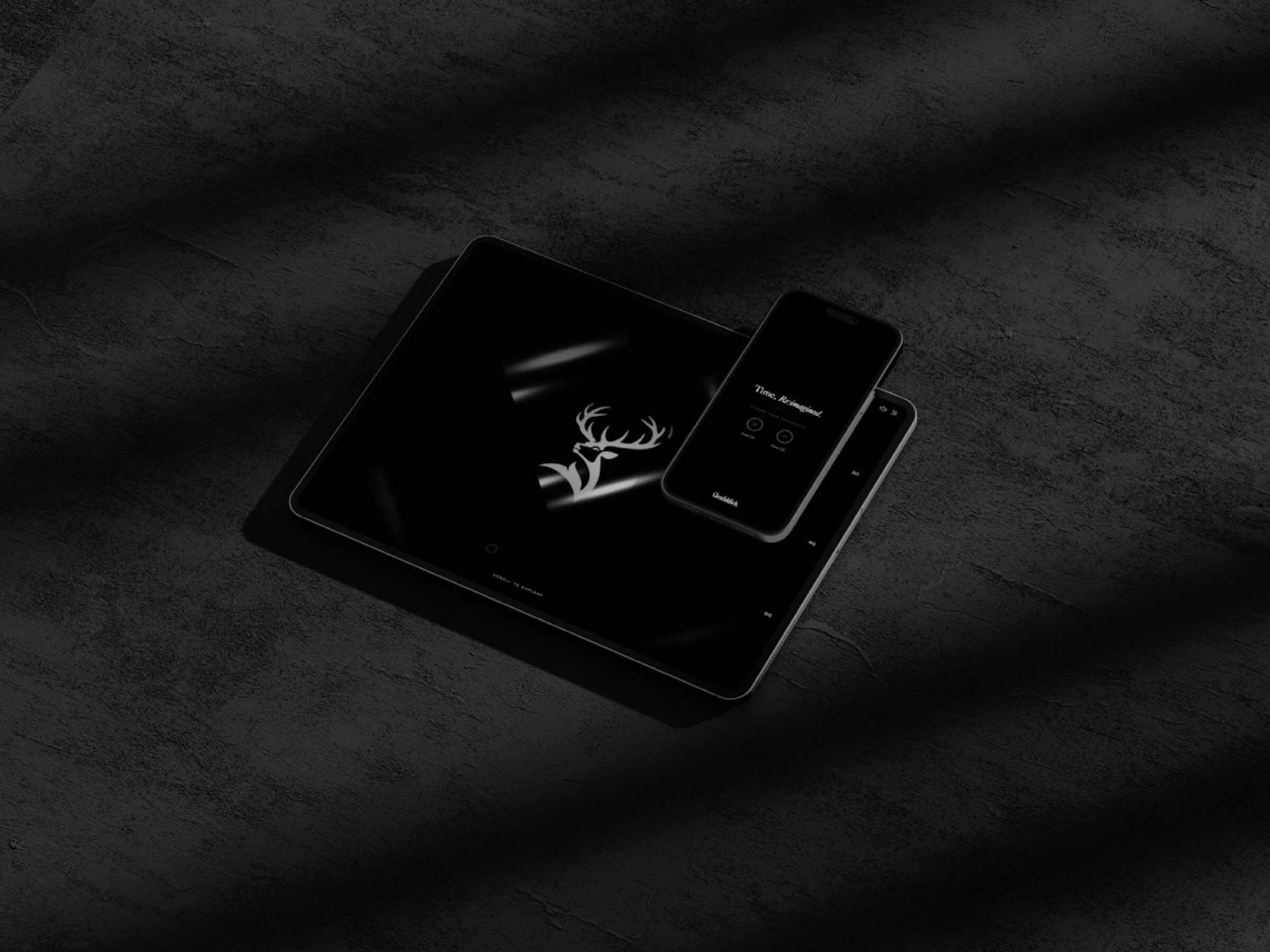
"Brands, in their endeavour to transcend the mundane & expected, must step boldly into the realm of experiences"
The concept of luxury has evolved far beyond the tangible appeal of opulent materials and exquisite craftsmanship. It has burgeoned into an arena where storytelling converges with experience, where brands strive not only to sell items but to weave narratives that resonate deeply with their clientele. In this pursuit, the conventional has given way to the interactive, the static to the dynamic, the passive to the participatory.
A mere static presentation of a luxury product, no matter how meticulously designed, is akin to displaying a beautifully composed sentence devoid of punctuation. It lacks the rhythm, the cadence, the momentum that sparks engagement. Brands, in their endeavour to transcend the mundane & expected, must step boldly into the realm of experiences. The fusion of innovative technology and imaginative narrative allows for the creation of interactive interfaces that breathe life into products.
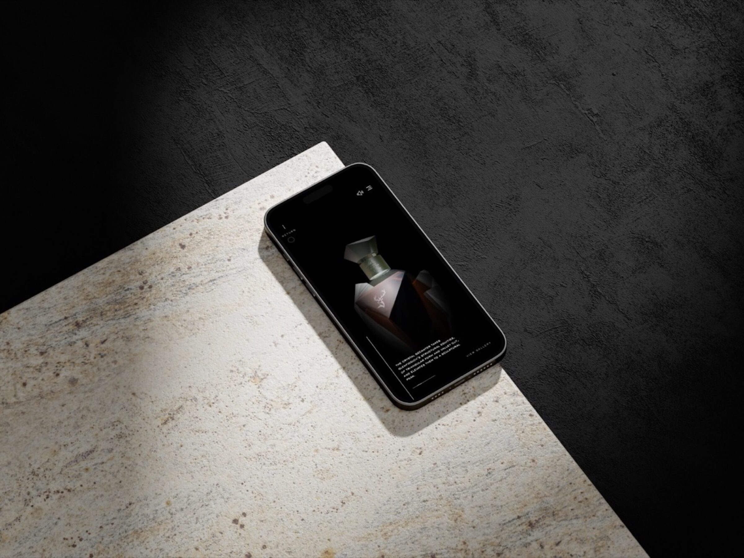
Consider the traditional product launch, confined to the unveiling of an item in a controlled setting. Now, imagine amplifying this experience with interactivity. A virtual and sensorial environment where visitors can manipulate, observe, and even influence the subject in three-dimensional space. This is not just a presentation, it's an invitation to immerse oneself in the conceptual world that birthed the product. It's a symbiotic relationship between the object and the observer, a dance of perspectives and insights.
Motion, a symphony of movement, brings forth a new layer of engagement. It's no longer enough to see a luxury watch in isolation. It must be witnessed in its element, adorning a wrist with a graceful sweep of time. The gentle unfurling of a handbag's features, the intricate ballet of a sports car through a cityscape; these moments of motion transcend the static frame and offer a visceral connection. They invite the observer to envision ownership. To contemplate the sensation of possession. To spark desire.
The allure of luxury lies not just in visual splendour, but in tactility and the sensuality of engagement. Here, the realm of 3D & sonic interaction serves as a bridge between sight, sound and touch. The ability to rotate, inspect, and interact with the range, immersed in a soundscape, draws the visitor into a multi-sensory encounter, blurring the lines between the virtual realm and the physical world.
“Just as a novel surrounds its readers in a narrative world, the Time, Re:Imagined experience envelops its visitors in a journey through time and craftsmanship.”
With our experimental digital case study for Glenfiddich's Time, Re:Imagined, we explored how we could use technology to bring the products to life in a more dynamic theatre. A virtual stage of non-linear audiovisual interaction that can be explored by the viewer in their own way — unfolding and fluidly morphing between states to unveil the product and bring it closer to the visitor.
More than a video — we allowed the visitor to move forwards, backwards, even sideways in time. Pushing modern web technology to its limit, we recreated the Glenfiddich Time Re:Imagined Series in a digital space using web-based 3D software, three.js.
We collaborated with Where Giants Roam to re-create our packaging designs as low-polygon, browser-compatible models, which we could then manipulate with code. All rendering is performed in real-time by the browser, meaning the experience can be controlled by the device; tactile and immersive encounters are no more than a finger-swipe away. Visitors can move through the scene in different ways. It becomes free, fluid. Organic. On top of that, real-time 3D rendering means the data footprint of the experience is much more lightweight — sidestepping traditionally heavy video files of animations and CGIs, in favour of models and cameras orchestrated in real-time at a fraction of the data (and energy) cost. With code, we assemble the scene on-demand, and display it live as each user interacts.
This endeavour was more than a showcase; it was an exploration of how the marriage of storytelling and technology can transcend the boundaries of traditional presentation. Just as a novel surrounds its readers in a narrative world, the Time, Re:Imagined experience envelops its visitors in a journey through time and craftsmanship. It's an experience that goes beyond the static confines of a label or an image, offering a deeper encounter with the essence of the product.
“Luxury brands must emerge as curators of experiences, sculptors of narratives that resonate on a profound level”
In this digital ballet, the observer becomes the choreographer, directing their engagement and exploration. It doesn't just tell the story of the product designs, it invites you to interact with that story, to trace the contours of time, and to engage with the details and dedication that lie within each pack.
As technology continues to evolve, so do our avenues of connection. This digital pas de deux with Glenfiddich's Time, Re:Imagined series is no exception. It brings the product to life, not just through visual representation, but through a symphony of interaction and exploration. In this digital age, where experiences transcend physical boundaries, our exploration with Glenfiddich is a testament to the power of innovation and imagination in the realm of luxury storytelling.
Luxury brands, in their pursuit of elevation, must transcend the notion of products as mere commodities. They must emerge as curators of experiences, sculptors of narratives that resonate on a profound level. In this age of digital immersion, where the boundaries between reality and the virtual are increasingly porous, interactive interfaces wield an unprecedented power. They are the conduits through which stories are not just told but lived, through which products are not just seen, but felt.
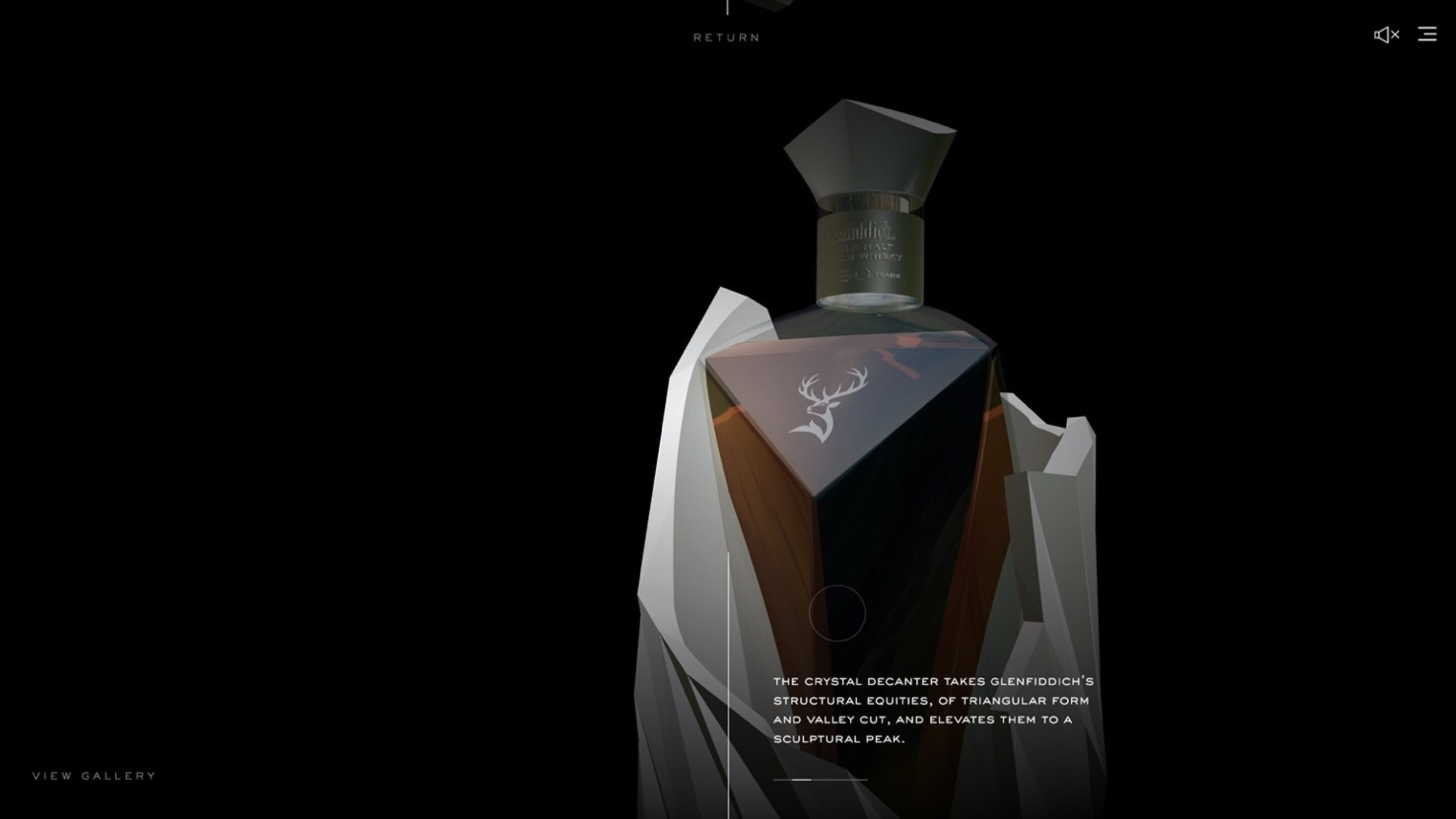
When light moves across an object, you can feel it. And now, with the canvas of interactive interfaces, you can also manipulate it, explore it, make it your own. The luxury sector is not just witnessing an evolution; it's embarking on a revolution that blurs the lines between creator and audience, object and subject. It's a symphony of engagement, a ballet of innovation, and a journey that invites us all to partake in the waltz of luxury's evolving narrative.
Visit our interactive Time Re:Imagined case study here.

A sonic window of opportunity
— for brands advertising onlineWords
Josh Shires
Audio Director at Here.
The limited attention spans of online audiences are well-documented. Whilst there’s only so much control a brand can have over how long their audience sticks around, what brands can do better is to own the time they do have.
Online/digital advertising platforms are time-critical for brand attention. YouTube’s ad-skip function creates a 5-second window of opportunity to capture attention and make an impression, and viewing behaviours for Instagram Reels indicate brands have a matter of seconds to hook the viewer.
Research has shown that we – as humans – react to sound up to four times faster than visuals. It’s one of the primal instinctive abilities that we’ve kept hold of. This means sound taps into the subconscious – essentially, your body has started responding to the sound before you’ve had time to consciously register what you’ve heard. Another study found ads that included sonic brand cues were on average eight times more likely to be high performing on branded attention than ads relying solely on visual assets, but that less than 10% of the 2,000+ ads tested featured brand audio assets.
The combination of these two findings points to a hypothesis that for brands advertising across these fast-paced channels, sound is one of the most powerful (and underused) tools available. And one way to harness it is through a short, impactful standalone brand asset: a dynamic logo. The gaming sector is a great reference point for this: where historically most brands have placed their dynamic logo (sonic + motion, i.e. Netflix) at the end of ads and content, every official game trailer released by PlayStation, Xbox, and Nintendo opens with the brand’s dynamic logo sitting upfront, much like the 20th Century Fox ident opens a film.
Irrespective of whether the trailer’s seen as an ad or viewed organically, the brand is sonically and visually asserted within that crucial 5-second window. In that moment, as it catches the eye and the ear, the dynamic logo leaves an imprint that builds brand awareness and recognition, and serves as a hallmark of ownership and authenticity, all before the viewer is either plunged into the world of ‘the product’ – in this case, the game itself – or given the opportunity to skip on to the next. I don’t know which of them moved first, but the rest have followed suit presumably seeing the importance of asserting their brand and laying claim to their games as a non-negotiable, necessary play.
Of ‘the big three’, I’ve always liked the simplicity and tactility of the Nintendo Switch dynamic logo - I think it’s distinctive, of the brand, and instantly recognisable. It’s clever in that it’s derived directly from the product experience, yet its effectiveness doesn’t rely on you having experienced the Switch yourself.

Nintendo Switch | Dynamic Logo - hear it here
© Nintendo Co., Ltd
The sonic logo mirrors the actual acoustic ‘click’ of the controller slotting into the console screen in a way that simultaneously cues preciseness (tech) and human influence (finger clicks). The motion counterpart mimics a similar movement: two controllers coming together with a soft (playful) bounce. This nods both to the Switch’s power-up moment signalling play is about to begin, and also to its ‘local’ in-the-same-room multiplayer features - a USP of sorts carved out against the backdrop of PlayStation and Xbox focussing on single player and online play. I’d speculate too that the sonic logo intentionally sounds like multiple (i.e. two) simultaneous clicks, in order to echo this functionality. Overall, a strong encapsulation of the brand and its product.
But back to the bigger picture, any brand with a presence in digital advertising can take a leaf out of the gaming brand book.
The overarching sentiment here is that it’s in the way you tell ‘em. Creating the right asset for the job is one (important) thing, but giving it the right platform and placement to perform is equally important. The big three in gaming have tooled up to adopt a new behaviour that delivers both; one that contributes to maximising impact across their most valuable channels.
As the channels and formats within the advertising landscape continue to grow and evolve, brands must interrogate whether they have the right assets to thrive across them, and actively leveraging audio as a pillar of the brand ecosystem should factor high on the agenda.
Modern Mythologies
— in celebration of storiesWord
Katy Pryer
Thousands of years ago, stories reigned supreme.
In the absence of concrete science and cold, hard facts, the truths of the world were hung on lofty legends - making sense of our surroundings by spinning a yarn. Myths, epics and folklore - whatever you want to call them, all provided the guiding principles for why the world was the way it was, and how to behave.
In this way, we’ve always told stories. Lest, we be crushed by the vastness of the universe’s greatest mysteries.
But these days, the world is becoming less mysterious by the minute. What we’ve gained in the age of information, we’ve lost in romance. We know more - and even if we don’t, the answer is but a whisper away.
Hey Siri, have we grown up and out of stories?
As a writer, this question might leave me quaking in my boots, quill all a quiver. However, working for an agency that champions the art of storytelling and fights for its relevance, I feel confident stories are here to stay. In fact, they’re everywhere.
Hermes, messenger of Mount Olympus, wings an online order your way, post-haste. Athletes the world over invoke the goddess of victory by the sole of their shoes and a siren seductively adorns your morning mocha, coaxing with cries of caffeine.
Though brought crashing down to earth, legends still live among us, very much alive and well in the modern canon. Only our modern mythologies now serve a different purpose. Less deriving meaning from the world, and more, adding depth to our everyday.
Though we no longer need to anchor ourselves in allegory, a story - a good one, still wins every time. In a crowded market, brands live or die by their differences. A brand without a backstory? Give me a break.
The Fife Arms, Hauser & Wirth’s revamped Victorian coaching inn in Braemar, is alive with a thousand histories, take your pick. Proof that bedtime stories are not just for small children, each room is inspired by a famous guest, from Robert Louis Stevenson to Lord Byron.
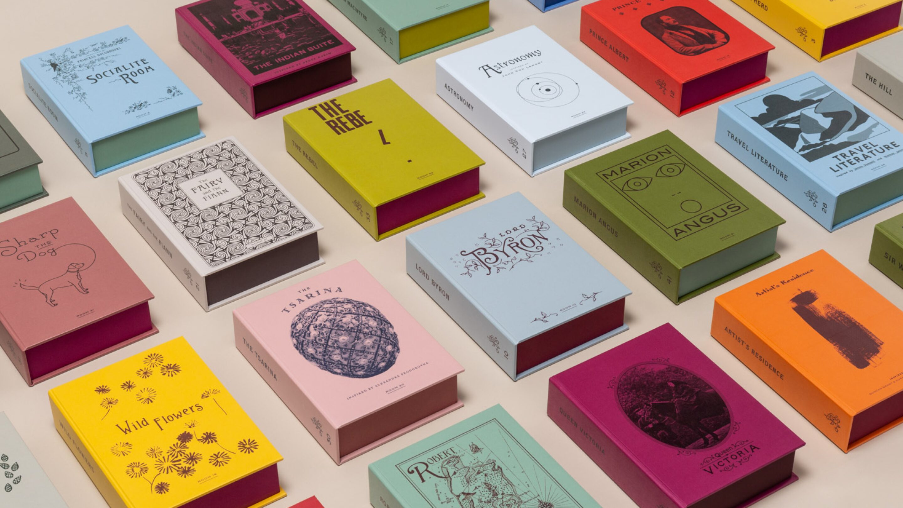
Its whisky bar, Berties, is a tribute to Prince Edward, affectionately named Dirty Bertie, and littered with easter egg clues related to the rougeish royal. If gin is more your tipple, you can raise a glass to the Spirited Princess, Queen Victoria’s rebellious fourth daughter, whose story wraps their house gin bottle, proud in purple and green - the colours of the Suffragette movement.
Another land (and brand) steeped in more than a few stories is Glendalough. It's said that centuries ago, in searching for greater meaning in nature, St Kevin discovered the green paradise nestled in the heart of Wicklow. The area is rich with ancient Irish Oak, and wild botanicals, adding character to their whisky and depth to their gin. But growing equally as abundantly, romance and legend by the forager’s basket load.
Fuelled by a quest for the finest flavours, Glendalough is a brand that ventures from its own forests to the woods of the world. From these adventures, they return richer with tales of their travels. You’ll find this in the red thread of fate that adorns the Mizunara whiskey, a reward for those that, like St Kevin, search for deeper meaning. Or, turn a bottle of wild botanical gin over in your hands, and discover an allegorical glass etching, a secret coded map of the valley.
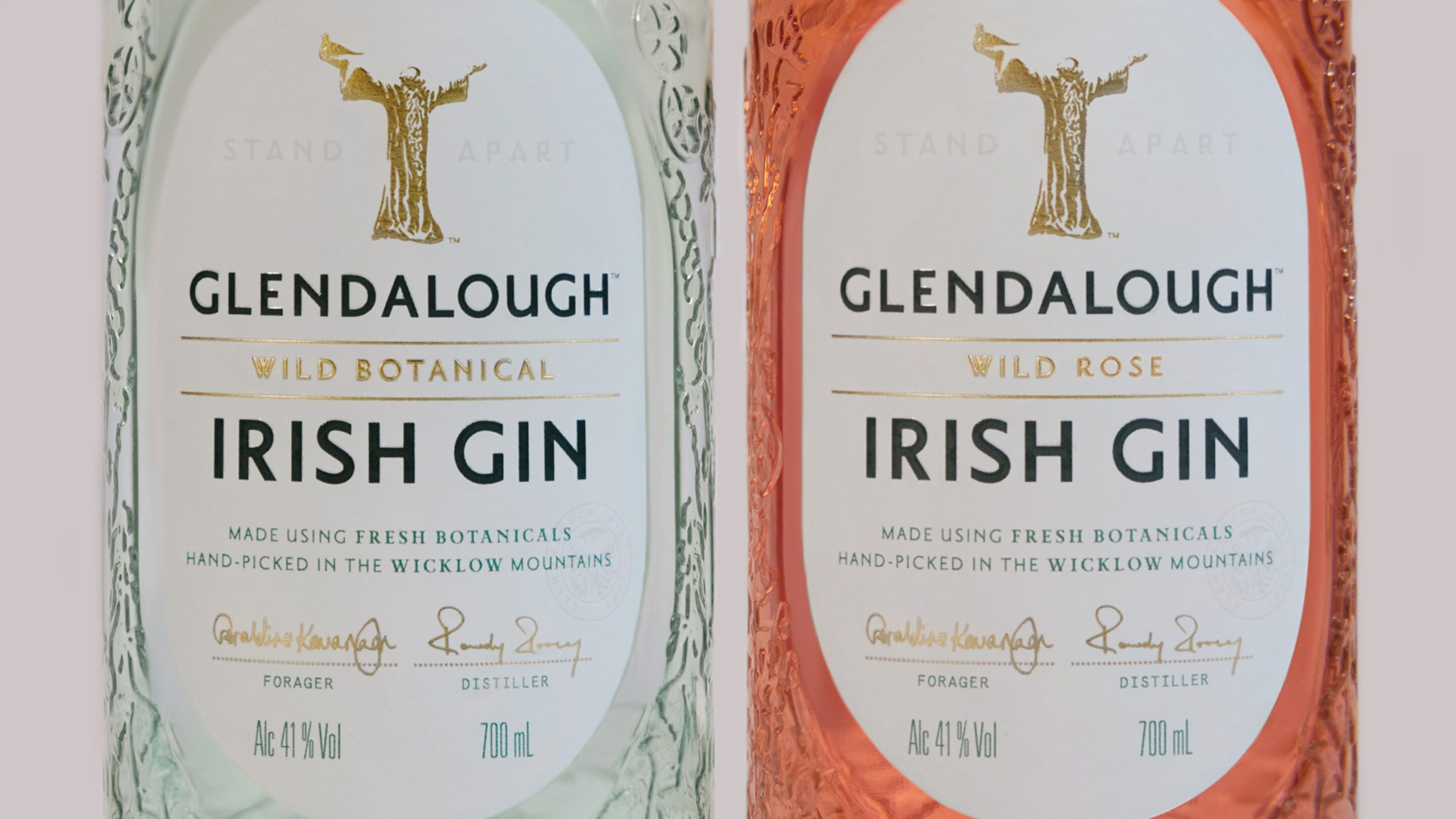
As the old proverb goes, An té a bhíonn siúlach, bíonn scéalach, “He who travels has stories to tell”.
The simple fact is that brands are more compelling when wrapped neatly in a narrative. And whilst nothing gets in the way of a good story like the truth, those stories built on a glimmer of something real and true resonate with us the most.
So, are you sitting comfortably? Then let me begin…

Awakening a brand through all the senses
— guiding Spirit brands cut through with Prestige rangesWord
Alastair Cliff
Chloe Schneider
At Here we are experts in helping our Spirits clients cut through with Prestige ranges.
In a world, where everyone is continually bombarded by brands' messages and media, for a brand to be relevant, they must earn their place in consumers’ time and mind. Brands need to create content which people want to let into their lives.
What do we think is the solution? The thing people will most willingly let into their lives is beauty. Where nature has always been a source of beauty, in contemporary society it is beautiful design that has become the dominant presence in our everyday lives. This is what we rely on to engage us and elevate our experiences.

Prestige has the scope to create beauty which allows brands to cut through. It is the closest to art, less compromised and speaks to a truth of where and why it was made. How things are made matters. The highs of the creative and production process are inseparable from the pleasure of the end result. An arrow of purpose and intention runs through the spirit. It pursues ideals – originality, mastery, humanity, truth.
Beauty is Truth, and for us all Prestige brands are rooted in a core Truth. This is why Prestige brands mean more to people. They have a story to tell, a provenance, a craft, a ritual that gives them a significance, relevance and longevity.
Many people design beautiful packaging, but Prestige requires more than that. It requires the creation of a beautiful multi-sensory brand eco-system which speaks to all the senses. At Here, we delight the eye, enchant the ear, arouse through scent, excite through taste, stimulate touch. This holistic approach creates meaning and storytelling that engages the entire mind and body. It keeps us alive, curious, interested.


When you hear the breaking of branches underfoot as you listen to someone walk through a wild Scottish landscape, the hidden depths of The Balvenie’s Story collection start to be unearthed and ring differently in your mind. A digital exploration of maverick time, offers new visions of aged whisky for The Glenfiddich Time Series and gives you a narrative of time that’s hard to forget. A bespoke glass Gaiwan bowl and ceramic sipping cups in a Japanese inspired tea ritual, slows our actions and focuses our attention on the flavour of The Balvenie in its purest form. An architectural BRIK chocolate pairing with a Prestige rum innovates with flavour, arrests with vivid colour and soars in front of you, making the story of the mountains around Zacapa unmissable. These expressions cut through and connect.
We tell the brand’s Truth through engaging every sensory touchpoint. Our multi-disciplinary team elevates Prestige ranges by creating brand ecosystems which mean more and awaken all the senses. This halo effect is illuminating – awakening brand attention as a whole. This is how we create brands which people want to bring into their lives.
I may be a millennial who works in a branding agency, but I still prefer to read something I can feel in my hands. I like the weight of a newspaper, the sturdy spine of a book. Call me analogue, or dare I say – romantic – but the art of writing, and the act of reading, aren’t lost on me yet. Turns out, it isn’t lost on the world either.
When businesses were going down during the pandemic, book sales were going up. So was readership. When Best Buy was shuttering its aisles, Barnes & Noble was experiencing an unexpected resurgence of sales. Was this simply a temporary swell of literary lust, or a reminder of the ability of stories to soothe and suture? And what does the annual revenue of big box stories in America have to do with the future of branding? Nothing, and everything.
An image makes an impact. Words spark an exchange. After all, what is an Apple without the invitation to “Think Different”? Would De Beers sparkle a little less in its category if it hadn’t coined the iconic phrase “A diamond is forever”? Look at a billboard, an Instagram ad, the bottle in your hand, and scrub the words with the magic eraser in your mind. An ad is dissolved into a pretty picture without a point. A brand becomes a bundle of contextless colours. Erode the narrative, and you’ll find that a skeleton of a house alone can’t conjure a sense of home.
This past October, I went to Ad Week in New York City. It was a high-octane experience, fuelled by enthusiasm, laminated name tags, and branded M&Ms. Amidst the overwhelm, a few key themes bobbed to the surface of an industry battling a chapter of seasickness. There was a collective realisation that we must learn how to play nicely with the robots, and simultaneously, learn how to be human again.
Guest speaker Deepak Chopra maybe said it best: “The one who leads is the one who has the best story.” Unsurprisingly, that guru is onto something. We’ve been operating like we’re in the branding business, but people aren’t logic processors. People are processors of stories. We continue to consume myths as hungrily as I consumed those free M&M’s. We’re not in the branding business, we’re in the memory business.
When Patagonia launched its sustainability campaign, it wasn’t the design that won the world over. It was the simple sentence: “The Earth is Our Only Shareholder.” It worked because it was smart. It landed because it was human. That small selection of words tells an entire story, not just about a company and its values, but about our world and its fragile future. The best words make big ideas seem easy. They make you think, “I wish I had thought of that.”
When we sought to redefine a new range of whiskey for Balvenie, we knew we had to go deeper than tasting notes and cask quality. We didn’t want to rely on old tricks to create new demand, we wanted to create a new world. This is how the Balvenie Stories Range was crafted. Each liquid received its own cast of characters, colours, and context that make it rarer than its chemistry. When Allpress Espresso needed a brand book, we could have just given them one. They make good coffee. Why not just say that? Instead, we brought their vision to life in a comic. From coffee barista to industry thought leader, Mike Allpress offers the humble hero’s journey you didn’t know you needed with your takeaway. Layered storytelling when done effectively doesn’t add weight, it adds levity.
Everyone needs to understand the language of the brand before they believe in it. And the language you choose to speak is essential to your success. Design is a vessel that will take you from A to B, but words are an empathy tool that give your brand the depth required to truly connect. In a world of fragmentation, it’s our job to make brands whole again, and to do that, we’ll need to choose our words wisely.
There was a lot of talk of “meeting people where they are” at Ad Week, and there are echoes of that sentiment reverberating in creative brainstorms across London today. Where people are is on their iPhone in the office. Distracting themselves on the train home. Searching for something to read on standby at the airport. People are looking down, and sometimes, looking up. Give them something worth remembering when they do.
Heroes & role models
— in celebration of Black History MonthWords
Katy Pryer
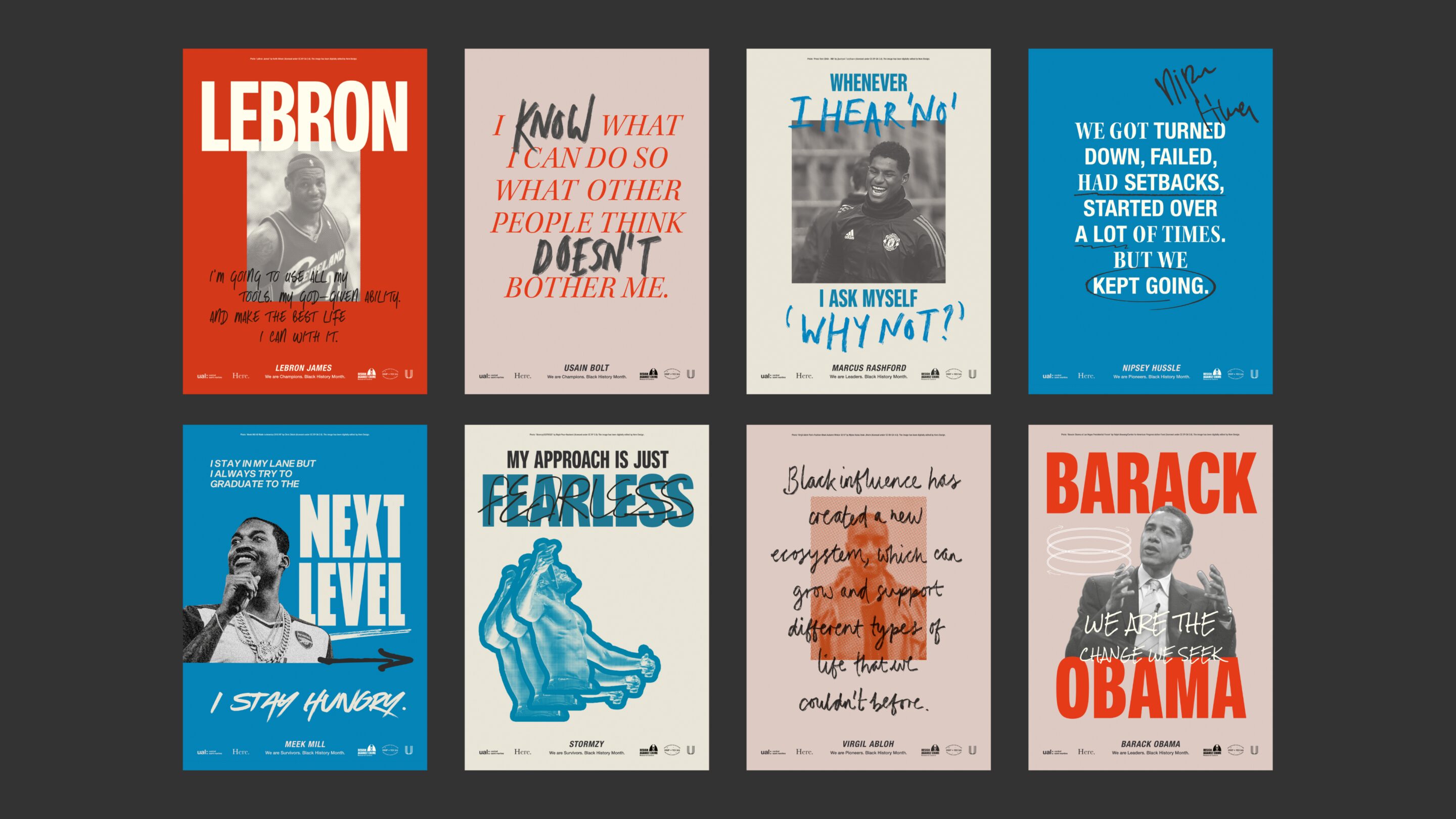
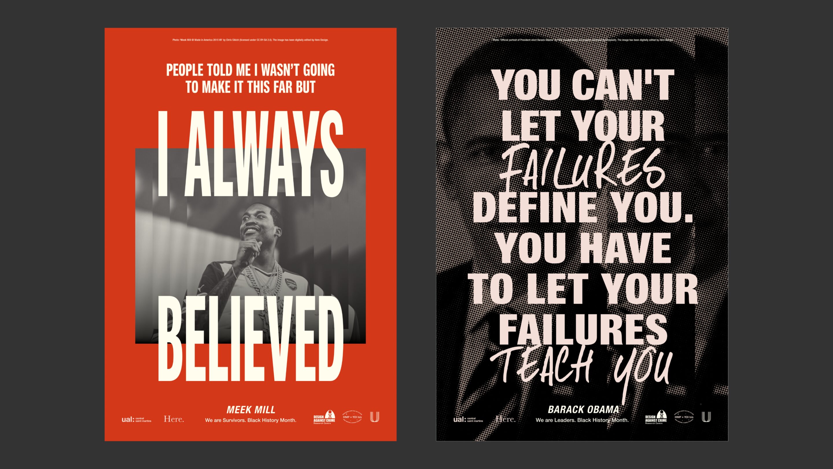
Who do you admire? Who are your heroes? Who might inspire you to change? These are the questions that inmates at HMP Isis were asked by the Design Against Crime Research Centre in July 2022. Aside from their mums and loved ones, (heroes, nonetheless), role models from the worlds of music, sport, and design, as well as the likes of Gandhi and Martin Luther King, came up time and time again. These answers inspired the poster designs we created in collaboration with Design Against Crime Research Centre and Central Saint Martins.
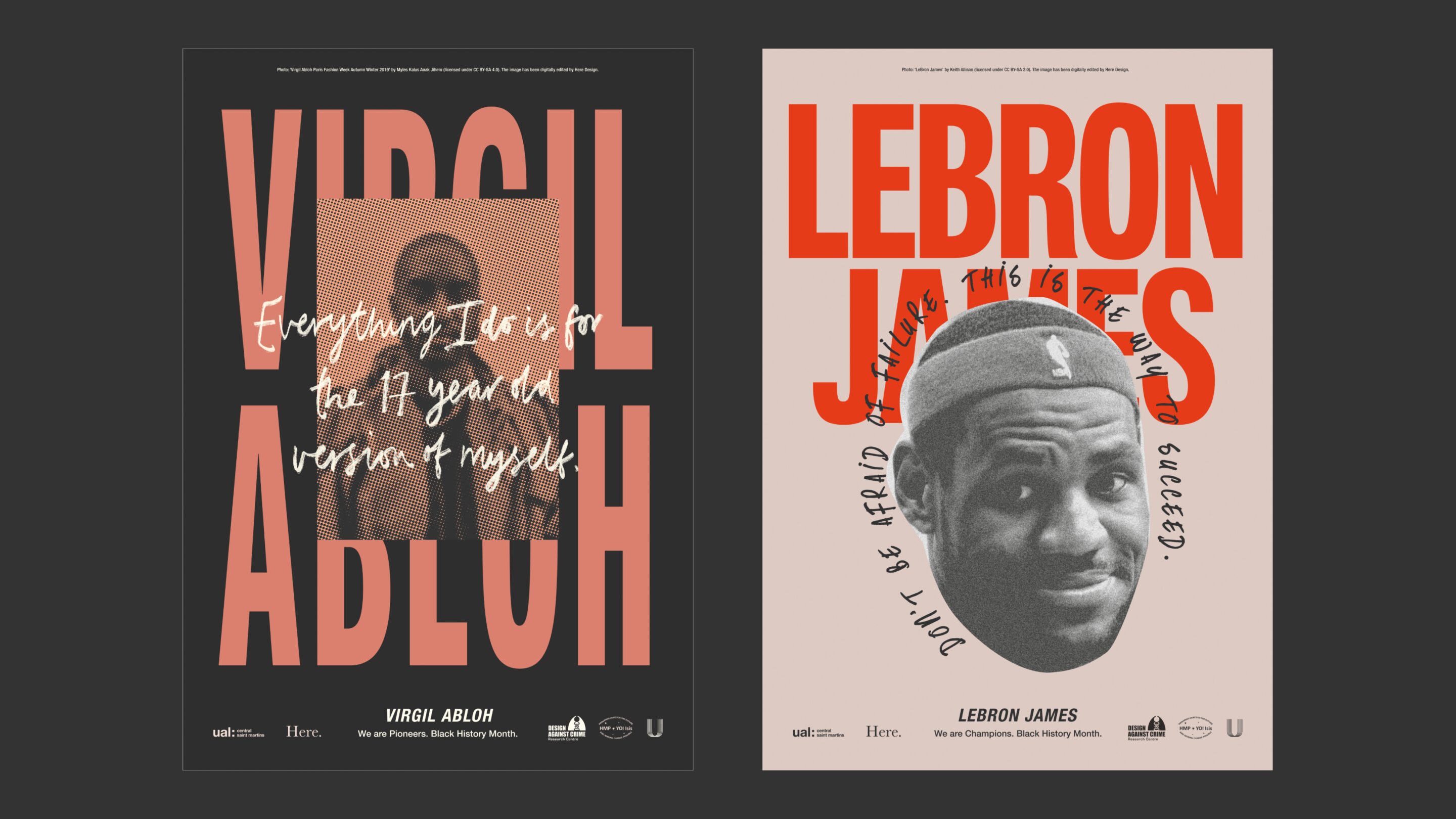
These posters bring that list to life, coupled with rallying words and inspiring thoughts from each, and will be seen across the HMP Isis prison estate, on wings and walkways from October 2022. Of the 650 18-28 year old inmates, 70% are Black, Asian and Ethnic Minority, and though created for Black History Month, these posters seek to provide on-going inspiration, all year round. Linked to the need to see it, to be it, the series hopes to provide something positive to look at and look up to.
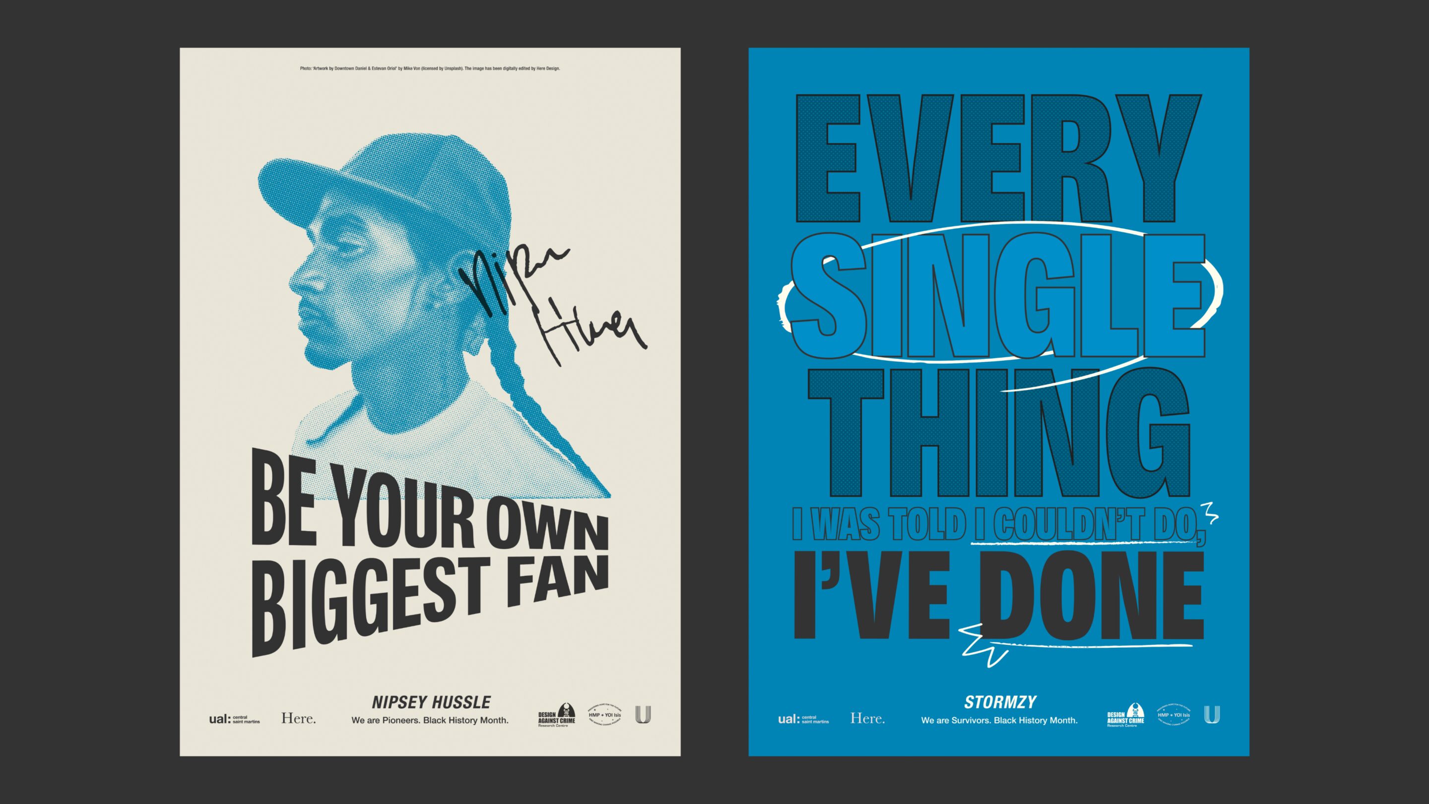
This marks the first output of our partnership with HMP Isis, the Design Against Crime Research Centre and CSM. 2023 will see the launch of Untold magazine created by prisoners and prison staff, as well as various education opportunities and collaborations between DACRC and UAL staff. Lastly, The Bromley Trust have provided a small training fund for People of Colour UAL art and design graduates who are interested in working in the prison and passing on their valuable skills.
Back to the future
— the bio-pioneers making innovation a thing of the pastFrom our pivotal position as a design studio, we have the opportunity to positively impact the world, connecting the right people and amplifying the right conversations. Our London Craft Week exhibition Beautility; How Fusing Beauty and Function Can Change the World came together as the purest distillation of this thought. The showcase itself celebrated bio-pioneering efforts of students from Central St Martins and what could be achieved when they were paired with real world change-makers in fashion, fragrance, and architecture. Curated and created by Here Design, the exhibition builds on our all-consuming belief in Beautility - the art of creating beautiful things with meaningful purpose.
When we think of innovation, it’s often the stuff of far-off futures. But innovation can also be rooted in the past – a revisitation of old methods and the most fundamental of components fused with future learnings. Or, future materials in the case of these three MA Material Futures students. And though their sights are set firmly on “tomorrow”, their lofty future imaginings all tell a story that connects us, both emotionally and physically, with our past.
Jesse Adler’s quest for colour is a return to simpler times before mainstream colourants made from fossil fuels became the norm. Discovering that mushrooms and lichens produce colour naturally and have done so without ceremony for over 250 million years, Jesse has found a way to recreate the CMYK palette with natural hues so vivid, they appear synthetic.
There’s something so primal and yet futuristic about her work. That, and the simple wonder that whilst we’ve been honing our synthetic (and to that point toxic) colours for years, all the while microorganisms have been carrying about their business quietly, but oh-so vividly for eons. To look upon her work is to look upon theirs, and in doing so, to travel back in time.
Partnered with ever-sustainable designer Rejina Pyo, Jesse’s colours are brought into the real-world and onto the catwalk, a tangible expression of how nature’s ancient ways can inspire us all.
Of all our senses, scent is the most primal, capable of tapping directly into our emotions and triggering thoughts and memories at a single sniff. Fitting then that Tetsuo Lin has turned to DNA, the very building blocks of life, to create a range of synthetic lab-grown scents. The idea was conceptualised with the help of designers, strategists, and writers from Here, and brought to life in partnership with skincare brand Haeckels. What makes this work so ground-breaking is that lab-grown scents require no essential oils or physical flora, thereby cutting out the mass-scale cultivation required of mainstream fragrance production and raising important questions about how we consume resources.
As the finite resources required for mass-produced glassmaking are called into question, the sustainable reputation of the material has become far from crystal clear. Inspired by ancient methodologies, Lulu Harrison found that all you need to create an eco-friendly version is sand, water and shells. Things you can find on the shores of the Thames. Her work brings together local and waste materials including invasive quagga mussels that block up Thames Water’s Transfer tunnels and usually head straight to landfill.
The natural minerals in these materials cause a variation in colour and clarity, tinging it a beautiful blue, so that each iteration of what she calls Thames Glass is not just tied to place, but to a time too. In doing so, Lulu has done the impossible, seemingly capturing time in a bottle.
As more and more architects shy away from glass, the award-winning founders of Bureau de Change saw opportunity in creating sustainable tiles made from Lulu’s Thames Glass. The intricate patterns are modeled on terracotta chimney pots designed by Royal Daulton, who, in a wonderfully cyclical turn of events, were also responsible for improving the city’s sanitation system in the 1870s. A full circle water cycle indeed.
It’s worth noting that these three iterations of innovation are merely at the beginning of their respective cycles. Who knows where they’ll lead? As we work in a time of climate crisis towards an ever more uncertain future, we are armed with only what has come before and the imagination to change what comes next.
Calling into question processes in 3 major industries, this work is a clarion call for more bio-pioneers that hold a deep reverence for the elemental. Because in uncertain times, it’s imperative that today’s forward thinkers look backwards too.
Imagination at scale
— Giving voice to clay with Clare TwomeyOur work at Here has always been inspired by the ethos of the arts and crafts movement, particularly the confluence of beauty and utility.
Over the years, we’re lucky to have worked with makers from all disciplines. One such collaborator is Clare Twomey, our partner on the RNOH Buttercup project. Clare is an artist and research fellow at the University of Westminster. Shown everywhere from the Tate to the National Modern Art Museum of Kyoto, her work primarily uses clay – often on a grand and dazzling scale.
What set you on the path to becoming an artist and, more specifically, a maker?
– I grew up in a house where we made everything we needed – and it was part of our joy. My mother was a seamstress and my father was an electrician who built half our house. I went out into the world feeling I could build my own world within it. That brilliant naivety helped me create a relationship with things I felt needed elevating or given a voice.
You primarily give voice through clay. Why this particular material?
– I ask myself the same question every day. I think it’s the relationship. Clay isn’t just clay. It’s a communicator. Bone china, terracotta, stonewear; they speak to us in different ways. If you use a porcelain cup, you drink differently, pour differently, than, say, an American diner mug. Clay constantly echoes our humanness. It’s everyone’s material and gives us access to different conversations. We ask a lot of it, but we learn things from its responses.
That’s interesting. Clay is something natural and solid yet it’s so responsive to the human touch.
– It’s also humbling. Clay fails all the time. Ceramists, glassmakers, weavers – we’re all humbled by our materials. But that’s crafting. That’s the meditation of practice. You’re never going to arrive, you just get moments of success.
We worked together on a project for the RNOH charity, creating 2,000 ceramic buttercups to raise money for the hospital. During our initial research, we found this lovely story about children picking buttercups and selling them to raise funds for the hospital back in the thirties. We knew what we wanted to create, but we didn’t quite know how. So we got on the phone to you…
– And I’m glad you did. For me, the story was about hope. This idea of picking buttercups and carefully carrying them across London to sell for others. It’s an impossible thing, and I like impossible things. Each piece represents the children’s hope and resilience. We’re carrying those little voices into another era so they can perform again.
You often work with large groups to create your artworks. Why do you choose to involve so many people?
– Impressive scale requires people. We can do more together than we can alone, in all aspects of life. It creates community too. With the buttercups, I hope everyone who buys one feels part of a group. That’s the reason many of my artworks are dispersed. I want them to become nudges in our lives, reminders of our experiences. For me, objects hold memories in a way photos can’t.
Monument, your piece in the Paris Museum of Modern Art, is a breathtaking mountain of broken china. Much like the buttercups, individually the pieces look fragile, but together they’re imposing and strong. How did this piece of work come about?
– It’s about stepping into the industrial process – and the skills and humanity that abound in places like Wedgwood, Royal Crown Derby and Portmeirion. I take their broken china. These beautiful objects with no home that still represent the history of their time.
When we first showed the piece 10 years ago, it was talking about the preciousness of objects and the fragility of history. It was a monument to the failed things in the world. Now, I see it as a representation of our environment.
– It stands at the entrance of the museum so people walk in and see this big, glittery pile of broken china. It’s quite terrifying at first because it reminds you of every single thing you’ve broken. Then, you look closer, and it becomes a miracle. Look at all this! How did it get here? There’s a magic at play.
What draws you to working at huge scales?
– I need to say things in an ambitious way to take other people’s hopes and voices with me. The massive sculptures represent my ambition too. I want to make incredible work that captures people. I’m an artist of my time. I was lucky to arrive when the Royal Academy was putting on incredible installation shows. They told me more was possible.
Thank you Clare, it’s been a pleasure talking with you.
Link to RNOH project.
You can buy your own RNOH ceramic buttercup here.
Brik by Brik
— The sweet joy of making with Raffaella BaruzzoRaffaella smiles as she melts the latest batch of white chocolate. Her excitement and passion for her craft is reflected in our attention. Like children in a candy shop, we watch, silent, as she whisks the now silky mix and spreads it on a slab of marble. Marble doesn’t retain heat, we’re told, so the chocolate tempers quickly. She ladles it into a tray, before banging it heartily to even out the surface.
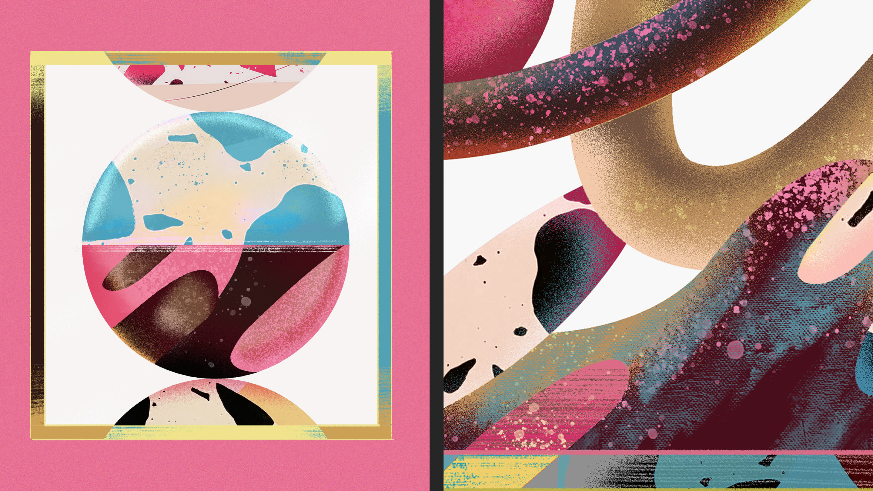
Raffaella walks us through a selection of her creations. Each requires perseverance, imagination and a dash of daring. Yet, to me, one stands out. It’s a chocolate bar, yes. But it’s also an elegant slab of Carrara marble. To achieve this, Raffaella and her business partner Kia Utzon-Frank looked to the Japanese art of sashiko. They broke a white bar and ‘glued’ it back together with coloured black chocolate. They did this again. And again. Nine times later, they had the desired effect: a tile of chocolate almost indistinguishable from the real thing.
This experimentation with process is central to the Brik ethos. As Raffaella explains, ‘sometimes you don’t know what the making will involve until you begin. The process appears through your body while your mind struggles to catch up’. It’s a commitment to intuition, a freedom to explore, that has helped return a sense of wonder to the world of chocolate. ‘We wanted to help people rediscover their favourite treat. By incorporating unfamiliar materials like terrazzo, marble and concrete, we help people reframe their perceptions so everyone can discover chocolate again, as if for the first time.’
This way of thinking is also the starting point for many of Brik’s commercial projects. ‘A lot of clients initially ask for a bar with their logo on it.’ Instead, their invited into the kitchen and treated to a tasting. ‘We undress their preconceptions of what chocolate should be’, Raffaella says, ‘We say, no, your logo will be eaten. It will disappear. Instead we want to convert your brand into a flavour, a colour, an edible experience.’
As our talk draws to a close, Raffaella emphasises the importance of appreciating the time and effort involved in each bar. ‘We’re losing touch with the essence of production. We must always remember the craft and time that goes into making the goods we buy.’
She needn’t worry with this crowd. We’re all intent on savouring every last bite.
Remaking the world
— the power of gardens with Jinny BlomCraft Week celebrates the builders, the makers, the sculptors and the doers. Jinny Blom is all of the above.
Hers is a living canvas. Recently named Gardener of the Year by House & Garden, Jinny runs her own studio in Clerkenwell. A close friend of Here, we’ve worked together on books about her famed Arijiju retreat and her own philosophy, The Thoughtful Gardener. Most recently, we collaborated on the rebrand of The Fife Arms.
Reuniting for Craft Week, we discussed everything from brave new beginnings to designing in centuries.
How did your career come into bloom Jinny?
– It’s a hobby that got out of hand. I was originally a psychologist and psychotherapist working at the sticky end of mental health. It might sound unrelated, but it isn’t. I quickly realised my patients benefited greatly from being outside and in touch with nature.
I’d always loved messing about with plants and I could feel something growing inside me: I wanted to try being a landscaper. So, I stopped being a psychotherapist on Friday and started doing this on Monday – with zero training. I’ve since found that if you get up early every day, work hard, and try not to think too much, it eventually comes together.
It’s certainly worked for you. I think sometimes it’s helpful going into something a little naive. You’re not weighed down by what other people say is possible.
– It can push you. Of course, it does make one’s life harder. But fear is a great motivator. I had a mortgage to pay so, I felt, Christ, I better get the hang of this. Now, over 20 years later, I have a team of 14 at my studio. It’s a big practice, but I still design everything.
You recently designed the Sky Garden at Chelsea and Westminster Hospital. Does it feel like you’ve come full circle?
– I never let go of health. I’ve been the artist in residence at the hospital for a number of years. We did lots of research into the effect of art on patient health – and landscaping scores particularly well.
I’ve designed two gardens for the hospital now, with the latest for the ICU. We use soft colours, textural objects and plants that clean the air. Before, people were being killed by stress, like animals who suffer trauma. The gardens help bring them back to health. We’re all just little animals really.
All design changes through time but, in your role, you’re creating something which will mature over decades. That’s fascinating to us…
– Yes, our commitment needs to be very long term. If you’re planting a tree, you want it to be there in 100 years. That said, we live in a time of bulldozers. People want to plant their own expression. It’s something I find philosophically interesting and disturbing. We all believe we have greater authority over the earth than those who came before.
If you think back to our folk songs, oaks feature prominently. They’re the mighty oak, the anchor point. Yet, with global warming, we may soon not have any left. We’re literally losing our narrative thread. Landscaping can help us refind it, so the consideration is deep. This is why, weirdly, I don’t care so much about flowers. They’re ephemeral. It’s the structure, the trees, which will last.
There are movements afoot to get us back to nature, like rewilding. Does this give you hope?
– I’m controversial. I’m not sure about rewilding. I think it signifies our hubris. If you leave the world alone, it’s fine isn’t it? It doesn’t need us to rewild it. I think, if you’re a landowner and you want to ‘rewild’ it, that’s fairly egocentric. Instead, I see us as husbandmen. If you have the luxury of land, look after it.
In your book, you talk about thinking, sensing, harmonising, liberating... All these wonderful words. Could you tell us more about your creative practice?
– I wanted the book to be a practical guide to landscaping. This starts with thinking and looking. I was brought up with the mantra: think before you act. So, there’s a lot of thinking. I wander and talk to people, especially if I’m working in another culture.
I’m not a great sketcher either, so I take a lot of notes. I’ve got hundreds of little Moleskins, all stacked up and numbered.
Do you feel words can capture a garden better than, say, a photograph?
– Absolutely. A garden is a performance. Garden photography can be challenging, which is why it was so nice to work with Here. When it came to the writing, I went back to the William Morris approach. Each piece of text had a different role. Each gave a different narrative thrust.
It’s interesting you mention William Morris. We’re really connected to the arts and craft movement, particularly the idea of fusing beauty and usefulness – and the power of natural materials. Do you feel close to it too?
– Oh, definitely. I’m a bit appalled we haven’t come up with anything as good since. It really is the most articulate design movement.
My world is all about natural materials too. It’s very elemental: stone, wood, metal, water, earth in all its glory. That’s my positive thought really. That everything on earth is from the earth. While we’re busy wrecking it with fossil fuels and plastics, I do wonder whether it’ll actually be OK – because it all comes from here.
It’s a positive thought. Talking of the future, are there any projects you’re excited to see come to fruition?
– Just all of them. I’ve been on site today and had to get scrubbed up quickly to come here. We’re working on a fully artificial landscape in the middle of Grosvenor Square – but it feels completely natural. It’s a reimagined Venetian palazzo, not the usual clipped, manicured stuff you usually see between posh London homes. It’s wild, a little crazy, and I love it.
Thank you Jinny. It’s been a pleasure as always.
Link to Here’s work with Jinny.
Beautility
— How fusing beauty & function can change the worldWords
Kate Marlow
For London Craft Week 2022 we have collaborated with the students from the Material Futures MA at Central Saint Martins to show how innovation in the biosphere can light the path to a sustainable future. By rethinking materiality, these bio-pioneers are solving today’s challenges to anticipate tomorrow’s needs. Together with leading brands, we present their discoveries as world-changing future visions.
Taking part in the exhibition will be Thames Water, architecture studio Bureau de Change, skincare and fragrance brand Haeckels and fashion label Rejina Pyo, forming a design collective of brands that share our dedication to Beautility – an ambition to create beautiful and useful things.
The creation of beautiful things with meaningful purpose is a notion that informs all our work at Here and one we would like to share more widely. As a branding agency, we have the opportunity to make an impact and the responsibility to make it a good one.
Between the 11th and 13th of May, in The Academy Rooms on Brook Street in Mayfair the exhibition will showcase the material innovations across three main exhibits.
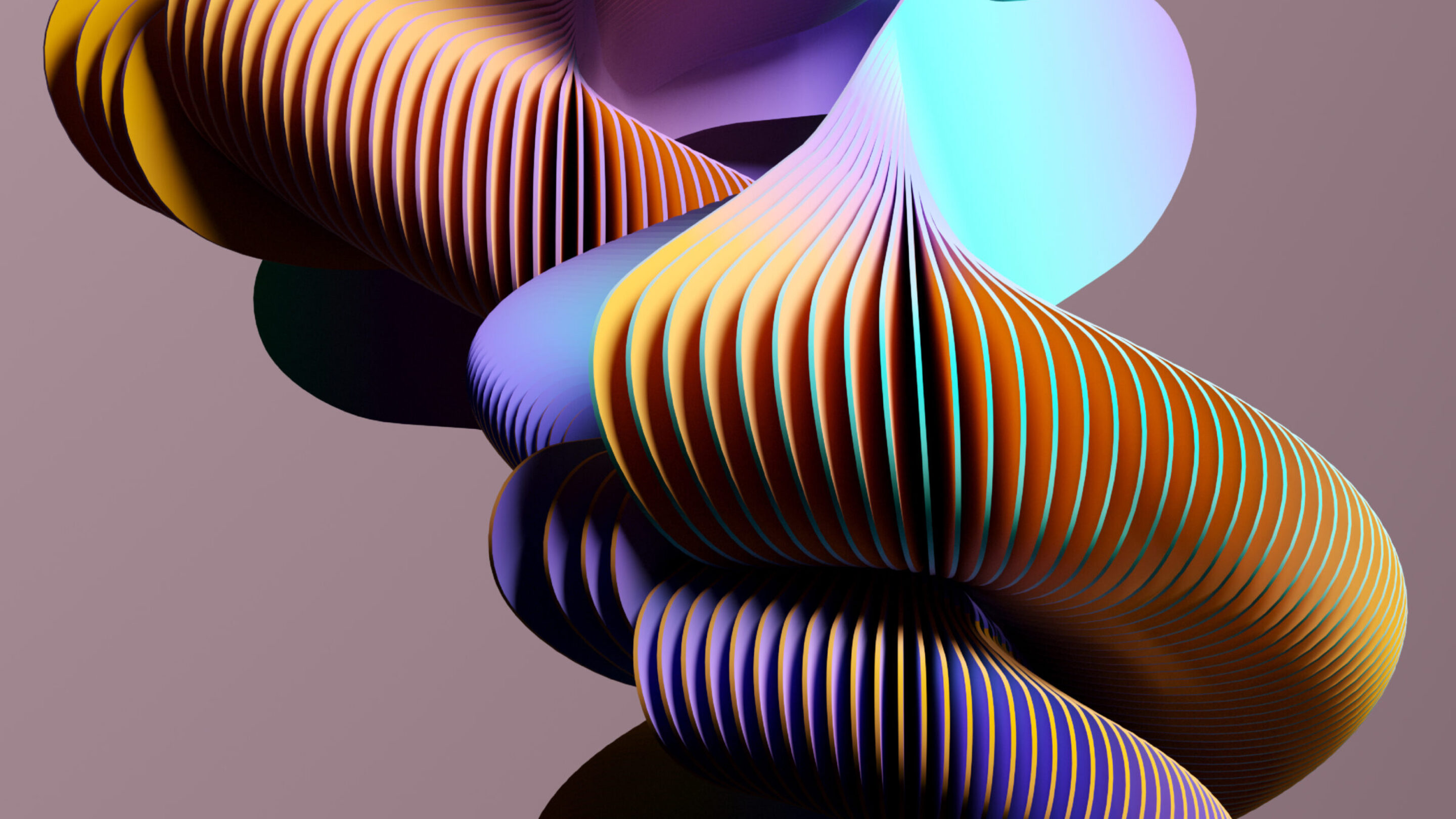
Thames Glass: Lulu Harrison x Thames Water x Bureau de Change
Quagga mussels are an invasive non-native species in the UK that cause blockages in Thames Water's transfer tunnels and are costly to remove, usually ending up in landfill. Supported by Thames Water, student Lulu Harrison has created a sustainable eco-glass unique to London and formed from the shells of this natural but nuisance by-product from the Thames.
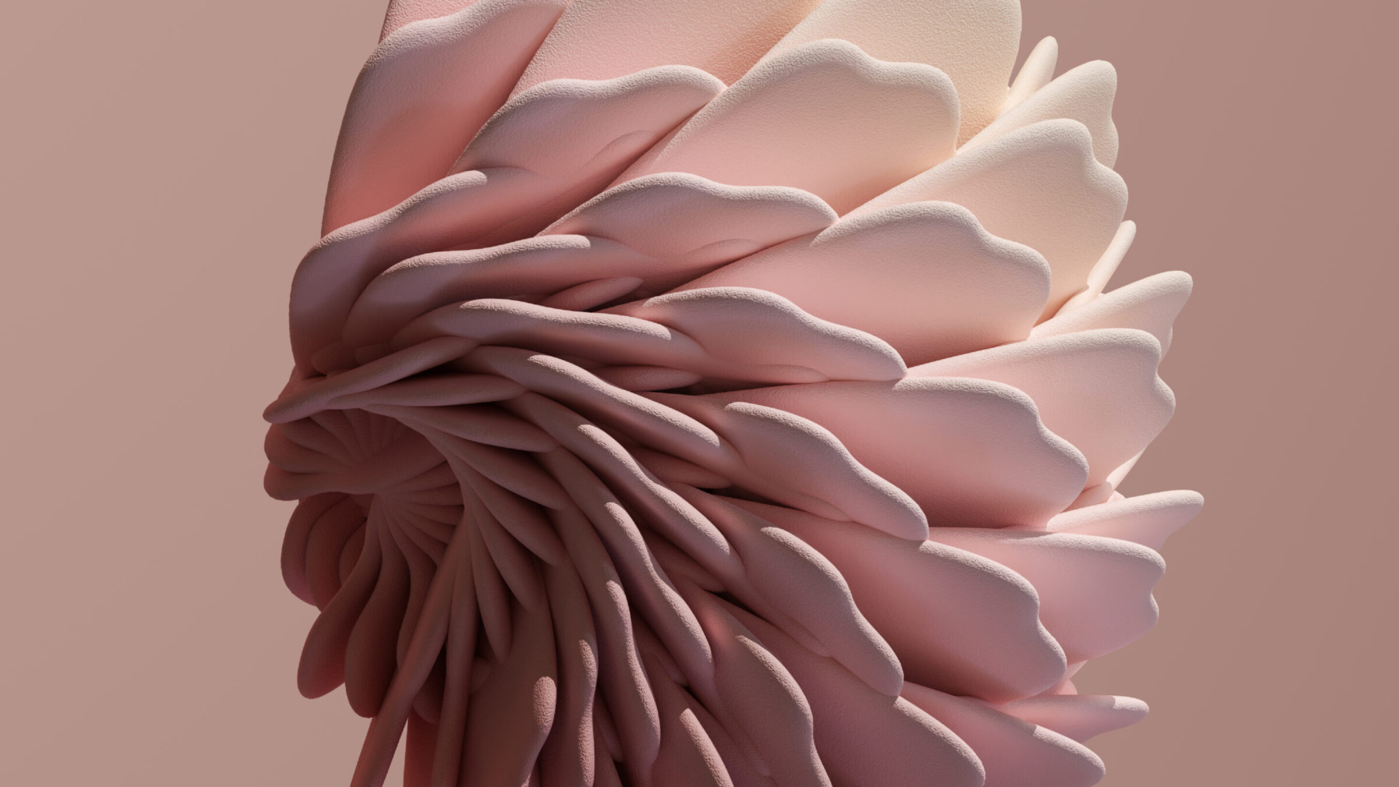
Colour Cultures: Jesse Adler x Rejina Pyo
Colour remains one of the most under-innovated areas in fashion sustainability. According to student Jesse Adler, colour cultivated from fungi like mushrooms, lichen and mould can be a safer and healthier alternative to synthetic colourants, and more scalable and economically viable than natural dyes. In collaboration with Adler and Here, London based fashion designer Rejina Pyo will demonstrate with a visual and immersive experience how these colours could make it onto the runways of the future.
Lab Grown Scent for a Sustainable Future: Tetsuo Lin x Haeckels
Student Tetsuo Lin will be joining forces with skincare and fragrance brand Haeckels. Lin and Haeckels are developing the idea of lab grown scent by synthetically producing it from DNA. By engineering scents in this way, the unnecessary waste and damaging of ecosystems through usage of natural materials in the beauty industry can be addressed.
—
Visit the interactive destination for more information, which has received critical acclaim for its design.
This type of digital showcase visibility is one of our signals for brand measurement & brand recognition, and illustrates how an identity can be successfully translated to digital to improve the user experience, but also to maximise reach & visibility through inspiring and shareable creative execution.
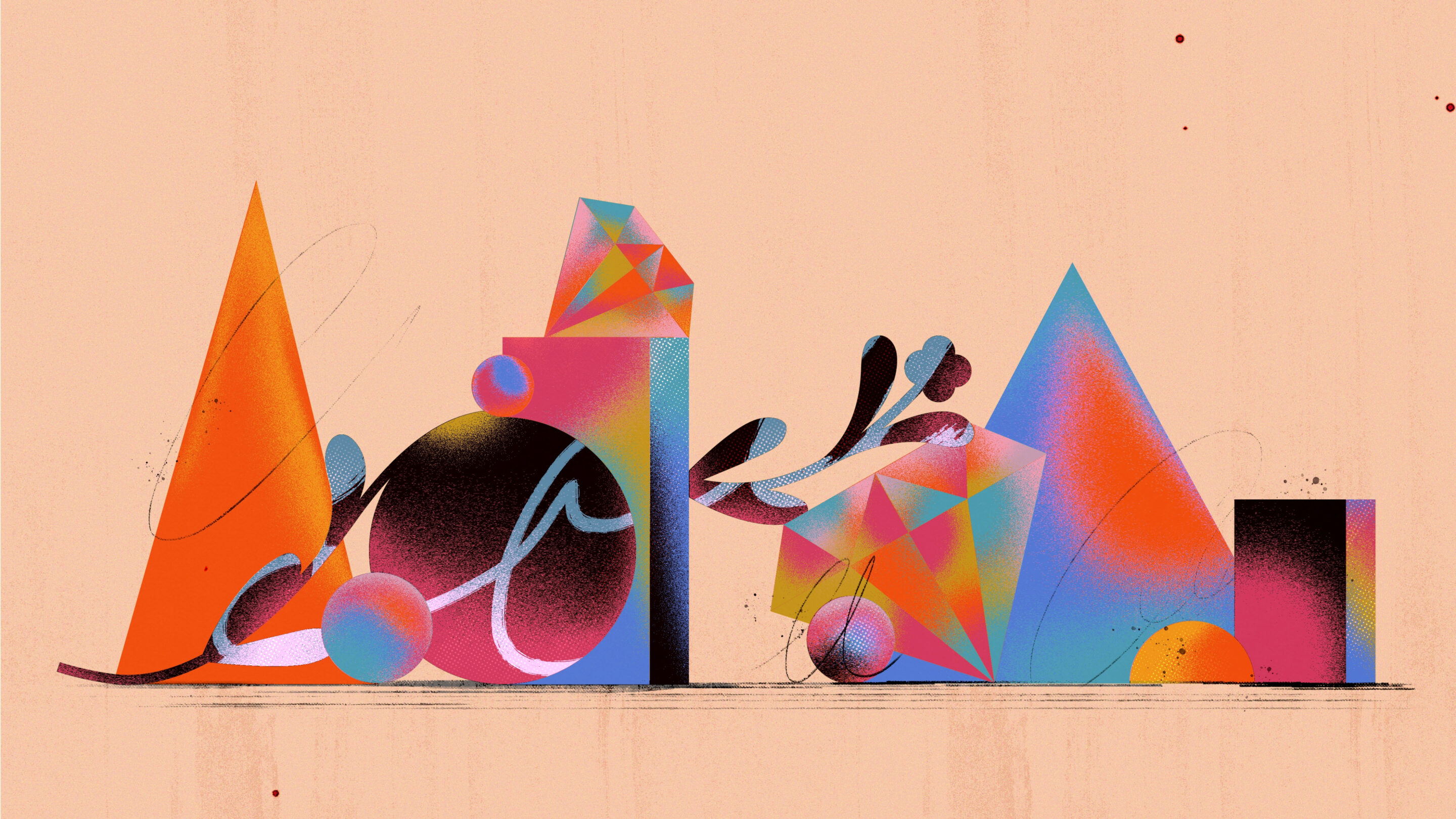
Truth, The Anchor of Luxury
— The foundation that permits audacious originalityThe outrageous nature of the world of luxury brands is no secret.
It is a place where people will pay extraordinary prices, and originality is the shared lingua franca. A place to cultivate and consummate your wildest desires, it’s all part of the fun.
But what permits luxury brands to behave in this way? The answer is a strong anchor in ‘truth’.
As societies, we have always been preoccupied with the pursuit of truth. It is the closest we can get to the essence of things. It is the provable and the real. Truth is the material world and the words we use to describe it. ‘The snow is white.’ Truth gives us something concrete, constant, complete. It satisfies and settles us.
Luxury brands have reflected this ultimate desire and grounded themselves in the essence of things, in the definition and discovery of truth itself.
They focus on ultimate materiality and material forms. They use the most authentic and heritage materials, as well as the most revolutionary and innovative ones. Take Burberry — a company founded on the principle that clothing should be designed to protect people from the British weather. In 1879, they invented gabardine, a breathable, waterproof, and hardwearing fabric that revolutionized outdoor wear. This April, they launched a curated ReBurberry Edit crafted in an innovative nylon yarn made from regenerated fishing nets and fabric scraps. In the past, Burberry has looked to the sculptures of Henry Moore to find the most vital, arresting, and human forms.
Artisan makers work closely with the essence of a material, they know it better than anyone else, they are closest to its truth. Their making is a real investment of time and skill captured in an object. Luxury brands foreground work done by hand — an activity that feels fundamental to what it means to be human.
Hermès is an exemplary storyteller of this kind and holds tightly onto the reins of its Parisian equestrian origins. Its film series ‘Footsteps Across the World’ shares portraits of saddler-leather workers in Paris and silk-marbling artisans in Kyoto. Luxury brands root themselves in time and place. This series reflects the brand’s commitment to the very best materials and its dedication to traditional and rare crafts, to keeping knowledge transmitted from generation to generation alive and relevant for a modern audience.
Alessandro Michele’s infinite creativity has made Gucci one of the most sought-after brands. But we mustn’t forget that this vision is built atop Gucci’s long-standing reputation for Italian craftsmanship, a pinnacle of quality and attention to detail. This is visible in their ornate bag closures and horse-bit loafer details that Michele has eclectically redesigned in forms such as tiger heads and shearling linings.
Luxury brands continue to search for the ultimate material forms, the tactile and tangible. Things that we can know and literally hold onto.
Alongside materiality, truth needs words — powerful, authoritative, and original definitions of what is. Luxury gets to define quality, luxury names it. It gets to point at something and call it luxury. Words cut to the essence of the thing and give it a name.
This is why naming is such an art in luxury brands: naming that bag, that perfume, that material, that color. Luxury brands are obsessed with this act of definition, of finding words that ring true to the essence of the object.
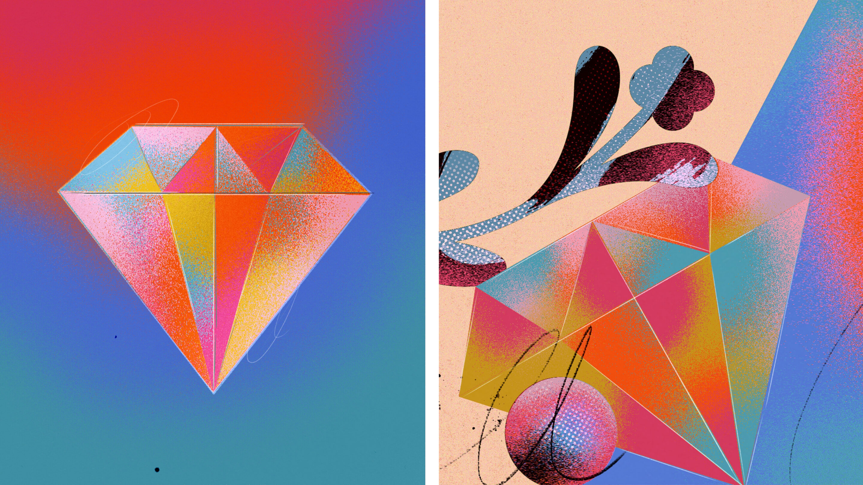
When Gabrielle Chanel created Chanel No.5, it was revolutionary, the first of its kind in scent, bottle, and name. It was named after the fifth sample given to her by the Tsar’s perfumer. An innovation for the time, it involved the use of aldehydes and offered complexity when most perfumes were single-note floral scents. The radical difference in christening the perfume No.5 helped name the difference and, of course, became iconic.
Byredo redefines ‘Pulp’ as a luxury name, speaking to the intensely evocative nature of the scent. Gucci promises decadence in a mascara that builds and builds. It selects charm and mystery as the thing this mascara should be about and names it ‘L’Obscur’. Authenticity matters and an original, skilled wordsmith is integral to creating luxury brands.
We might think it easy to pledge allegiance to ‘the truth, the whole truth, and nothing but the truth’. But not many can. Truth is the domain of luxury because only in luxury is the focus on the truth, in and of itself. In the mass-market, brands have to elevate a functional or material truth by association with an emotional one — the brand is created to enshrine this association. Luxury is different in that it is anchored in the definition, invention, or discovery of truth itself.
What differentiates luxury is the audacity of their commitment to a vision. They don’t compromise.
Although we tend to think of the truth as setting things in stone, in luxury the truth animates. ‘The truth will set us free’. An absolute commitment to the essentials, to establishing material truth and defining the essence of what matters, earns us the freedom to dream, and, if we desire, to be outrageous.
So, when Gucci is hyper-referential and surreal — releasing a Spring Summer 2020 campaign starring horses in absurd scenarios in Los Angeles — we believe in the fantasy because its luxury is rooted in so much truth.
This article originally appeared in Branding Mag
The Desk Experiment
— Embracing the rethink of our physical spaceOn Tuesday, March 17, 2020, the music and conversation in our studio slowly subsided, as each of us decamped to our homes.
Computers, screens, chairs followed, and by Monday, March 22, we were coming to terms with a new kind of working - in dusty corners of our houses. Seeing familiar faces, but at more acute and unforgiving angles. Our communal Friday lunch, a distant and now somehow outrageous memory. It was the acoustic experience, and the new demands on conversation etiquette, that took the most time to get used to - to resist the urge to finish our colleagues' sentences or to excitedly elaborate on an idea which (we now know) has the effect of shutting down the flow of any meaningful conversation.
Cut to today. What felt like a serious compromise in mid-March now feels entirely viable two months later. So much so that, as we begin to plan a gradual re-opening of our studio, the immediate rush back that we anticipated just isn't there. The assumed role of our studio needs a rethink to actively entice everyone - earn its place in people's lives again.
Breaking down our working experience into its constituent parts, it's clear that a big chunk of that time is spent meeting and talking - and it has now been proven that it is perfectly possible to replicate this remotely. With tools like Miro, even more complex collaborative creative sessions can be run online. So, to consider the role of a physical studio, we need to look at which components of our work experience can't be replicated online. Why are we not just dismissing our studio as a relic?
"Why are we not just dismissing our studio as a relic?"
At Here, we have always been advocates for the importance of tangible physical experiences as a counterpoint to our our digital existence - time spent looking at screens - and in the last few weeks this dynamic has gone into hyperdrive. Assuming we will continue to use remote-working technologies, the studio should more assertively become a creative stimulant - or more than that, a space designed for digital decompression. An experience that Thomas Heatherwick calls "Hyper Physical" in an article about the future of office design.
So, more than ever, the studio needs to be a space that uplifts us with its design and beauty—that justifies its existence by enriching our lives. A space that celebrates spontaneous conversation untainted by digital glitches and encourages more nuanced human communication like "the subtle affirmations of our humanity" that Cal Newport talks about in his New Yorker article "Why Remote Work Is So Hard—and How It Can Be Fixed." It needs to be a generous and safe space that encourages disruptive and spontaneous creative work with the analogue tools that will differentiate and rebalance us from our time spent in pixels: books, pens, paints, inks, paper and jokes. In many ways this new model relates back to a very old model - something much more like the idealistic art college experience.
And why not open this experience up to the clients we work with? With fewer people in the studio at any given time, as restrictions are relaxed it could become possible to dedicate more space to productive collaborative work with our clients in our studio.
One clear observation from this experience is that it has suited some people more than others - the introverts among us are seemingly flourishing in isolation - and in many ways this is a moment where ideas of self-realisation begin to translate to our choices about how to work. We are being taught to understand when we get the most out of focused work at home and when we will get more out of communal work at the studio.
It strikes us that this is a lesson that will be hard to unlearn and step back from, and as a consequence, we can safely assume that the role of the studio will never quite be the same again. Stripped of the more methodical aspects of work, it could actually become much more exciting.
This article originally appeared in Muse By Clio
Design and the Role of Beauty
— How to make capitalism your slaveLet’s start with the worst-case scenario – the difference between art and design at its most unflattering. Art is autonomous, has aura – a space around it in which to practice and encourage criticism; art is free.
In contrast Design is in chains. Design is capitalism’s slave, tethered to its commercial purposes which means it has no agency as a critical medium. Art is aimed in the direction of social ends – design commercial.
Design takes all our experiences, sensations, thoughts and desires and carefully crafts them into commercial products. It builds a smooth and surfaceless landscape of fulfilled desire where critical autonomy vanishes amid a kaleidoscope of depthless imagery.
Art arrests, prompts thought, challenges, stands apart and creates - through its distance and its intimacy - a space with which to question and understand our world, and ultimately change it. Whereas the headiest praise we can think of for design is for it to be effective.
We believe that good design has never been restricted to the effective fulfilment of functional objectives and that part of its aspiration lies in its role in the performance of beauty.
Beauty is a good thing. Beauty is transcendent - uplifting - and two things have happened in recent times that mean we are starved of beauty. The first thing, according to Victor Margolin and Richard Buchanan, is that “Design appears to have replaced nature as the dominant presence in human experience.”
The thing we see most – the thing that conditions, effects, affects our experiences is design - that’s a pretty serious responsibility on the shoulders of designers.
“Design appears to have replaced nature as the dominant presence in human experience.”
The second Thing is that there are no longer any ideas but things. We pull down lofty stuff and elevate the mundane. Our grotty little rationalist consumer society reduces everything lofty to the commonplace - idealism to realism; authority to parity - one-offs to reproductions, art to manufacturing. It then sets about raising up the lowly: brands, products become ideas and aspirations and ideals. So if art has been commoditised and nature marginalised where do we get our beauty from? Is Kate Moss enough?
At Here Design we believe we have a responsibility to ensure our designs are beautiful. When we design, we set out to solve problems like all designers. But while we do it we also set out to create something beautiful, something life-enhancing. We solve problems and try to create objects or environments or books of beauty. We are proud to be problem-solvers but we also see ourselves as something more. As harbingers of beauty.
Design is different from art - its relationship with capitalism problematises its critical faculty - we need to leave criticism to art. But as art increasingly loses interest in beauty, design can and should take over.
What does this mean for designers? Practice good design-thinking but I encourage you to sneak in a bit of beauty whenever you can. And remember that, yes, design is still capitalism’s slave but importantly capitalism is also our slave. We can harness its greed, its ambition, its reach and make it the loudspeaker to beauty. I encourage you all to have a covert mission: to fill the world with things that are not just useful (solving a problem) but are also beautiful.
The Luxury of Less
— What future are we creating?Words
Chloe Schneider
Luxury has been fixated on novelty in the search for originality. Yet newness may be losing its lustre as it comes up against big societal and environmental questions. Brands haven’t been blind to this shift with a recent acceleration in new thinking, revelations and radical new approaches when it comes to creating anew.
The current crises in climate coupled with the disruption of the Covid-19 pandemic have foregrounded a desire shared by many to slow down and reflect on our actions. To pause the constant production and accumulation we’ve innocently named 'progress', and take time to rethink and redesign the future where the picture isn’t so rosy. For many, particularly younger generations, it appears rather a lot is frankly unsustainable and reckless.
For Luxury one of the big questions is: how does it continue to innovate? Is it possible to retire constant newness for newness’s sake? What kind of transformations do we or should we actually value? What future are we creating?
Back in May, Gucci’s creative director Alessandro Michele shared diary entries from his home in Rome entitled ‘Notes From The Silence’. In it are a series of reflections: foundational questions around his own actions and the environmental damage of the fashion industry, a subject we are increasingly aware of. He wrote: "Above all, we understood we went way too far. Our reckless actions have burned the house we live in. We conceived of ourselves as separated from nature, we felt cunning and almighty. We usurped nature, we dominated and wounded it.” In response, he describes a new beginning, where as creatives we take more responsibility and build a less destructive future. For his part, it starts with an announcement that Gucci will “abandon the worn-out ritual of seasonalities and shows.” A brave move to step out of the ring at certain points during the fashion year.
The idea is: less is more. Fewer collections and less excessive newness. In its place, more time for creating better, for developing a dream and even, Michele believes, “the promise of an epiphany”.
“the promise of an epiphany”
He’s not alone. For countless independent Luxury brands with environmental consciousness built-in, smaller and more sustainably produced collections have long been the reality. Due to the extended pause on production for much of 2020, this autumn, some brands are selling a very limited number of items including archival pieces. Irish-based 31 Chapel Lane announced their discrete collection that “continues to build upon our established values of integrity, quality and sustainability”.
This notion that less is more goes hand-in-hand with the thought that creativity comes from constraint. Or, as Orson Welles put it, “the enemy of art is the absence of limitations”. This has been critical in powering thinking, particularly when it comes to inventing sustainable materials. Circular design is vital in preventing further environmental damage so a key focus has been on what can be produced purely from waste. Meet the new materials.
From well-known bioplastics to the wonderfully niche, new products are being fashioned from the most improbable materials. The ReBurberry Edit uses lightweight ECONYL® made from regenerated fishing nets, discarded fabric and industrial plastic, seamlessly fitting the urbane modern look of the brand. The Shellworks transforms the discarded shells of lobsters into a paper-like compostable material. Meanwhile, eco-packaging is finally popping up in Champagne - something to celebrate.
“The idea is less is more.”
Haeckels, a beauty brand out of Margate, has been one of the recent success stories. Their environmentally friendly products and off-white mycelium packaging – a kind of living, breathing mushroom pulp, that can be grown, recycled and readily decomposes – have gained much attention, and are stocked today across many of London’s most iconic and curated stores. They’ve innovated not only products, but trialled a new way to shop, selecting a couple of days where no form of money was accepted in their Margate store: trialling the circular economy, watching how the day unfolded and the incredible interactions with their customers. Haeckles is one of the many small giants continuously innovating in this space, spurring on the conversation, and making sustainability eminently chic.
One of the crucial shifts we are seeing is a psychological one: making the old ultra-desirable. As a society we’ve long been sold the unblemished newness things. But this is changing, upcycling has come to New York, London and Paris. When Vogue Ukraine fashion director Julie Pelipas walked to a haute couture show in Paris in an extremely oversized men’s suit pinned with big bunches flapping at her sides, everyone around took note. It was a statement look promoting her new brand Better that sells vintage men’s suits altered to fit women’s bodies. Artist Rua Carlota’s unique patchwork knits made with deadstock fabrics have similarly been a social media hit and lionised in the press. Numerous brands have joined this wave of making things entirely from excess fabrics and materials, Acne Studio being one of the latest to announce its repurposed collection. Visually clothes are cut and spliced together, giving a heightened sense of visual resourcefulness, of difference. It’s a challenging aesthetic but challenger behaviour is exactly what we need. We have to be shocked, arrested and allured in.
Of course these innovations aren’t exclusively limited to Luxury, Adidas and Nike trainers are a spectacular playground for new biomaterial and tech innovations. But Luxury brands’ behaviour in this space is all important. It sets an aspirational agenda that is influential. Up to a point, Luxury gets to name and define what is valuable. Additionally, if eminent brands can afford to get behind new materials they can give them the economies of scale they need to get off the ground. As Alessandro Michele points out "now, more than ever, [it] is necessary to build new and more powerful narrations.” Today’s powerful story: old has to be the new new.