The Fife Arms is a Braemar landmark. Originally a 19th century Victorian coaching inn, it has had various incarnations over the years before gallerists Hauser and Wirth developed it into a luxury hotel.
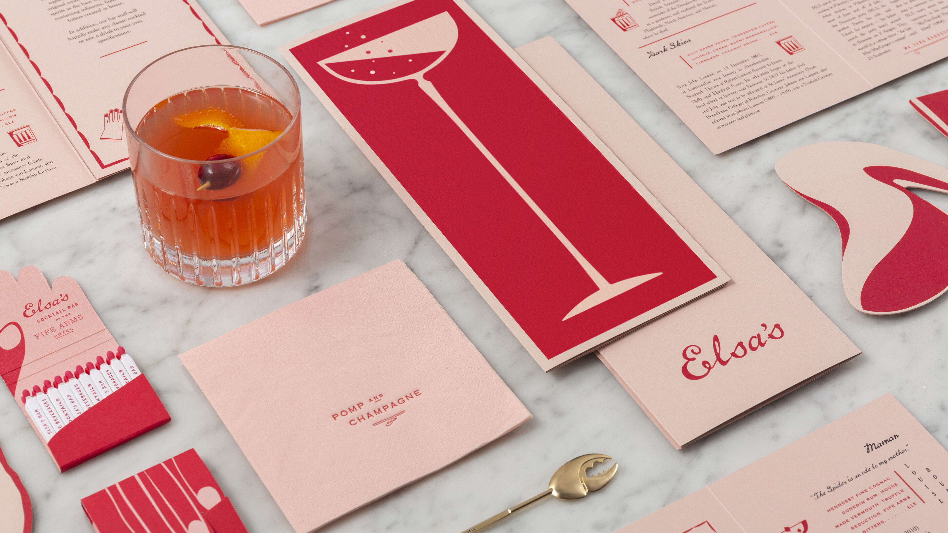
It’s a place full of stories, both real and imagined. Part archive, part art gallery, we are without hyperbole when we say this is a hotel unlike any other. The space is like a living portmanteau of styles, of eras, of ephemera; all brought to life through a new and richly evocative brand identity.
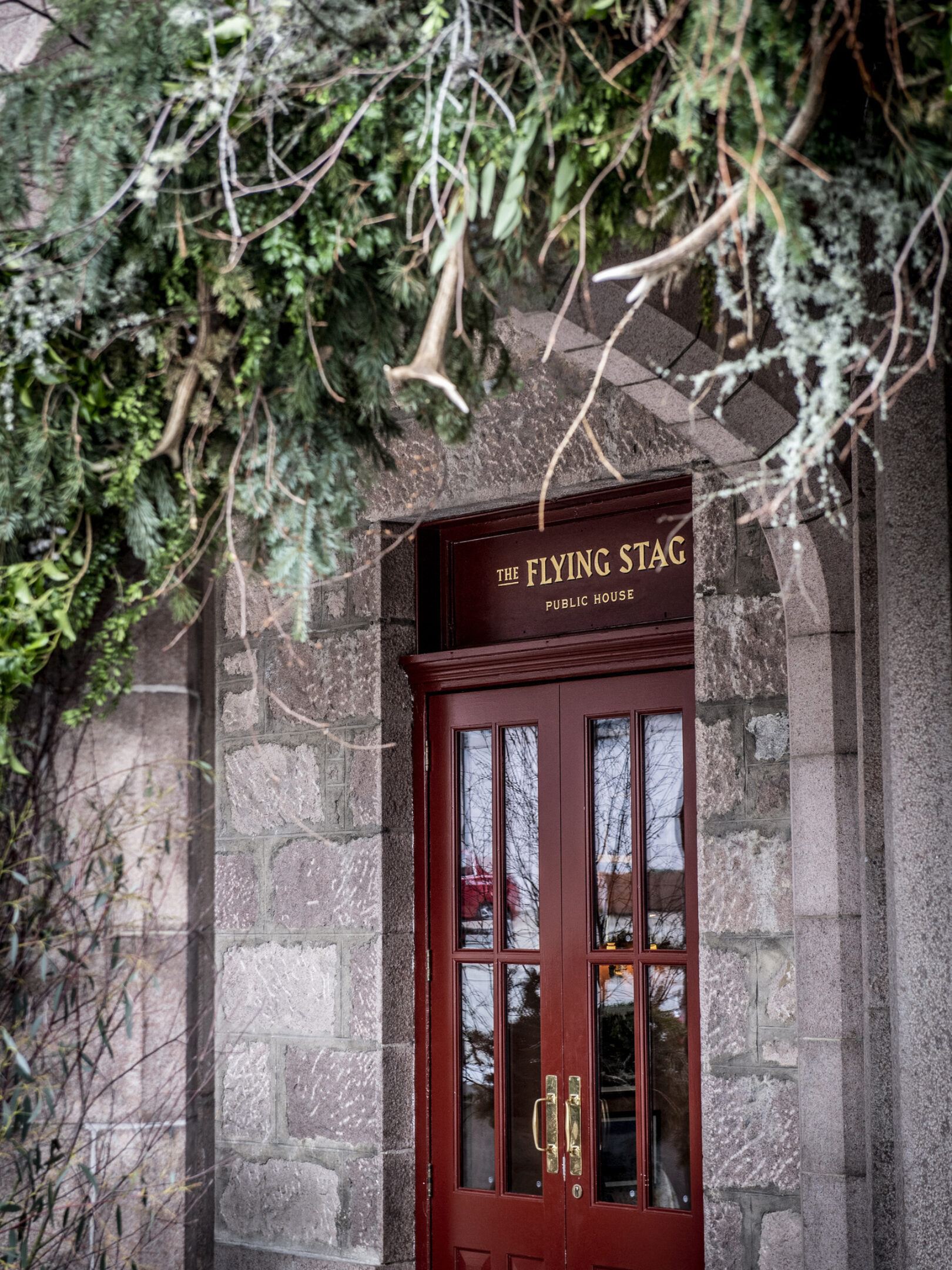
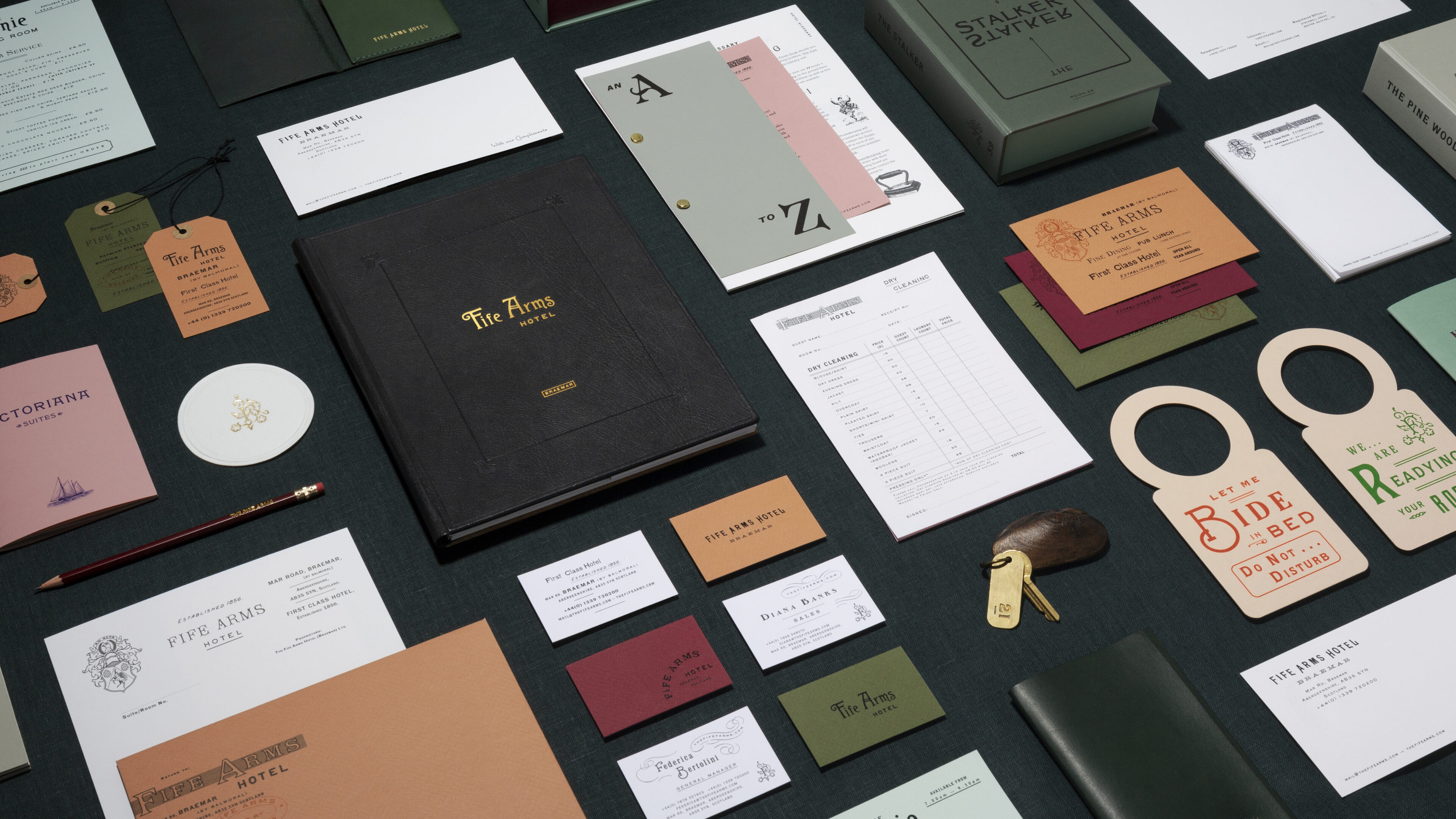
We began with the knowledge and wisdom of a group of specialist local historians, whose vast collections of reference points - catalogues, letters, paperwork, magazines, as well as the original Fife Arms signage - informed and inspired a new collection of typefaces and illustrative styles.
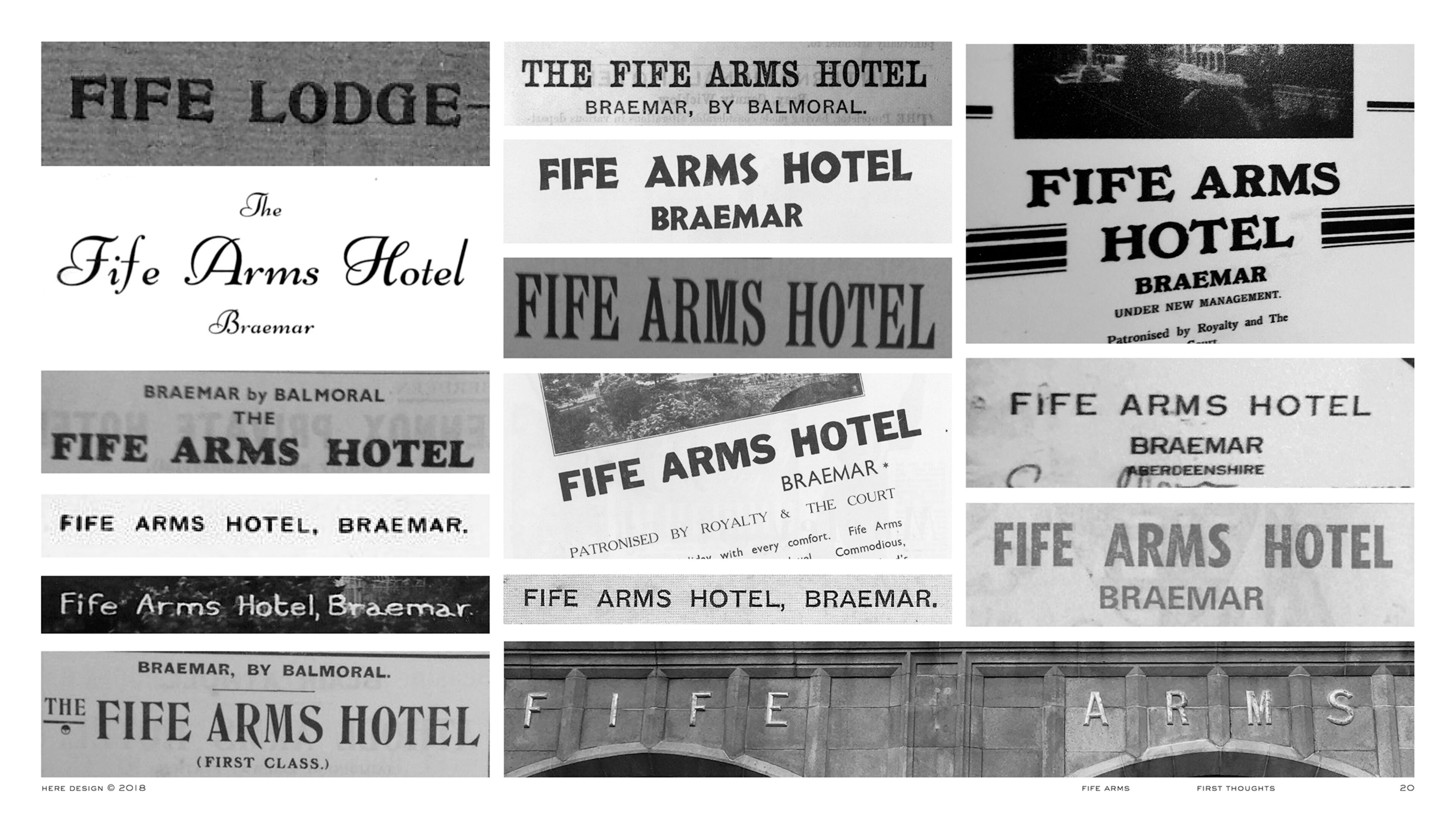
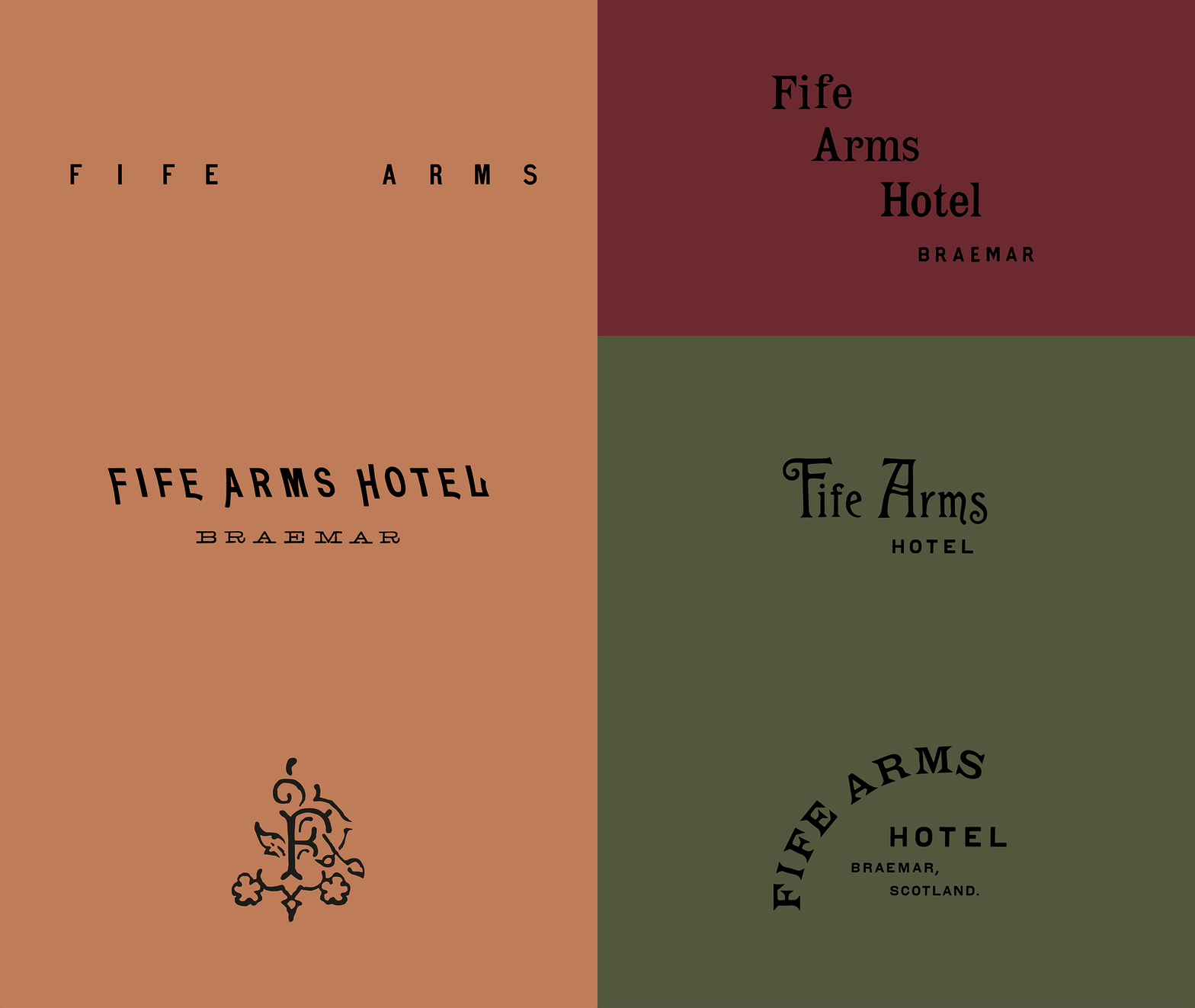
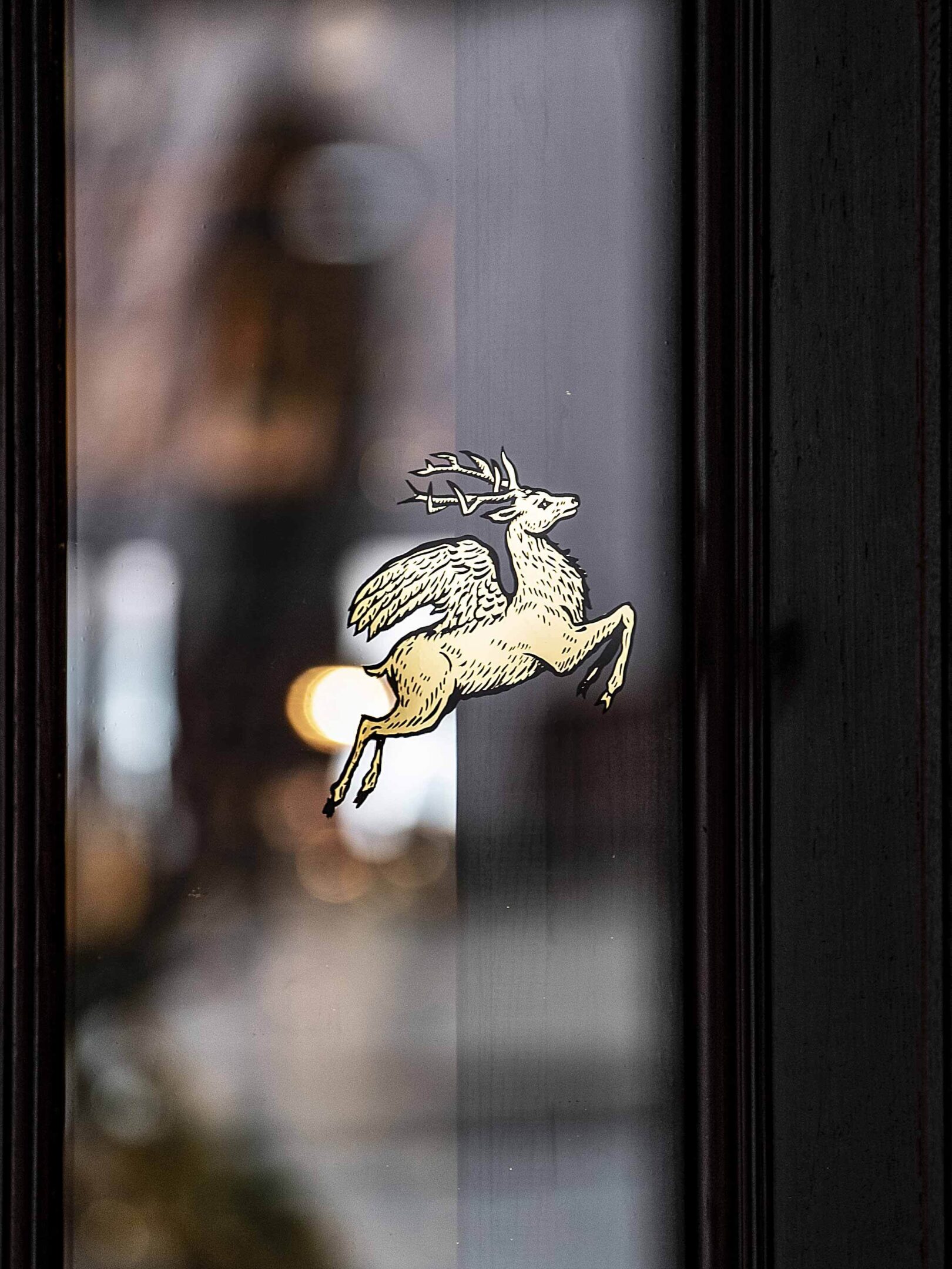
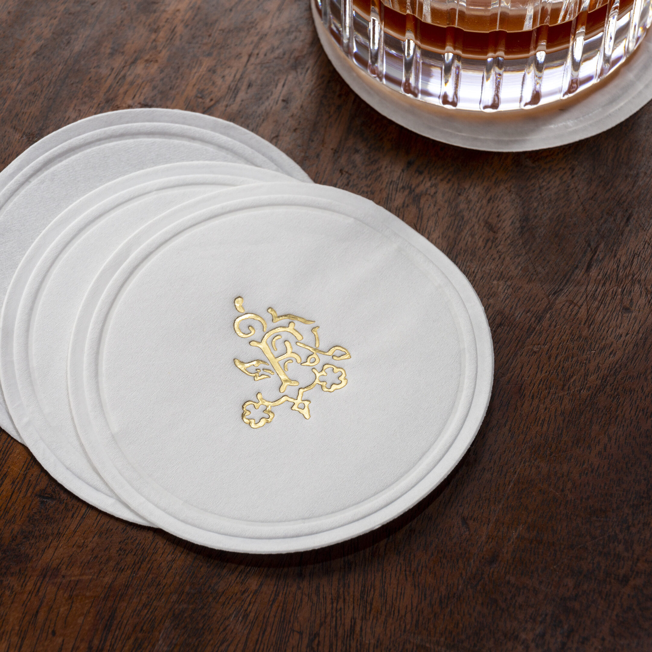
True to this history, the logo itself is not one, but many - a fluid system that is in harmony with the hotel’s eclectic interiors as well as Braemarian history.
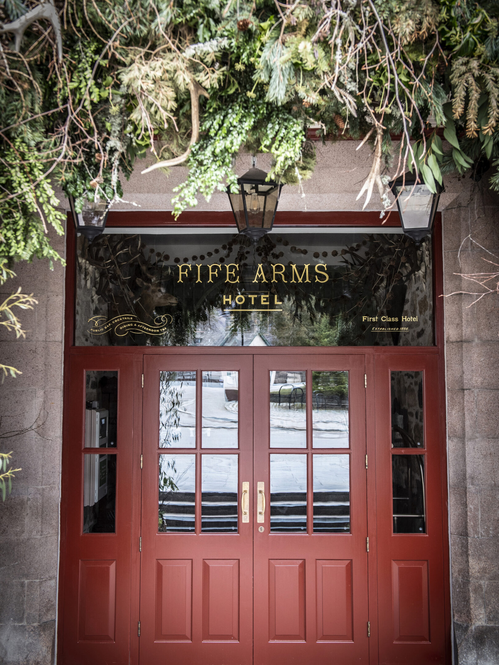
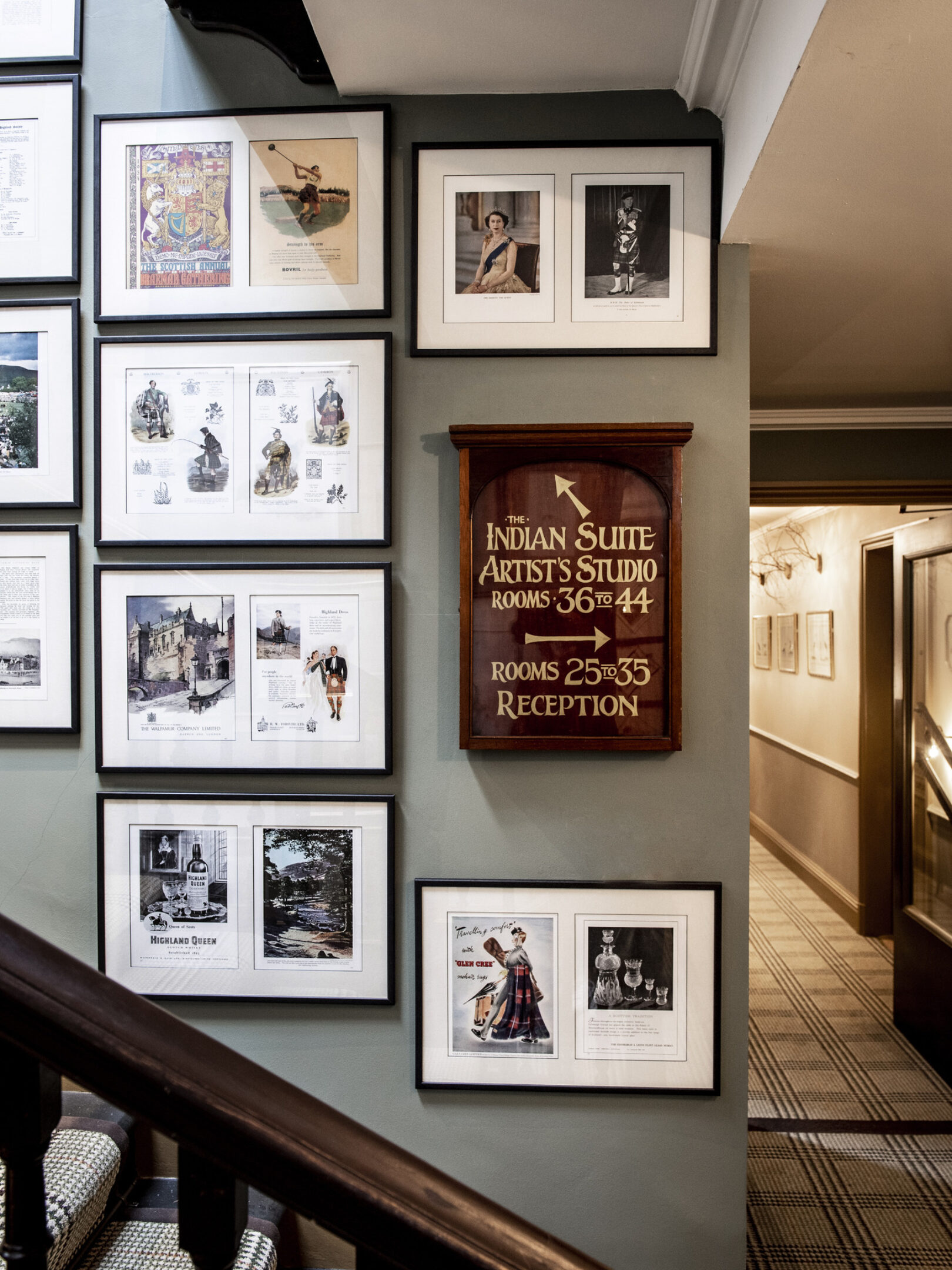
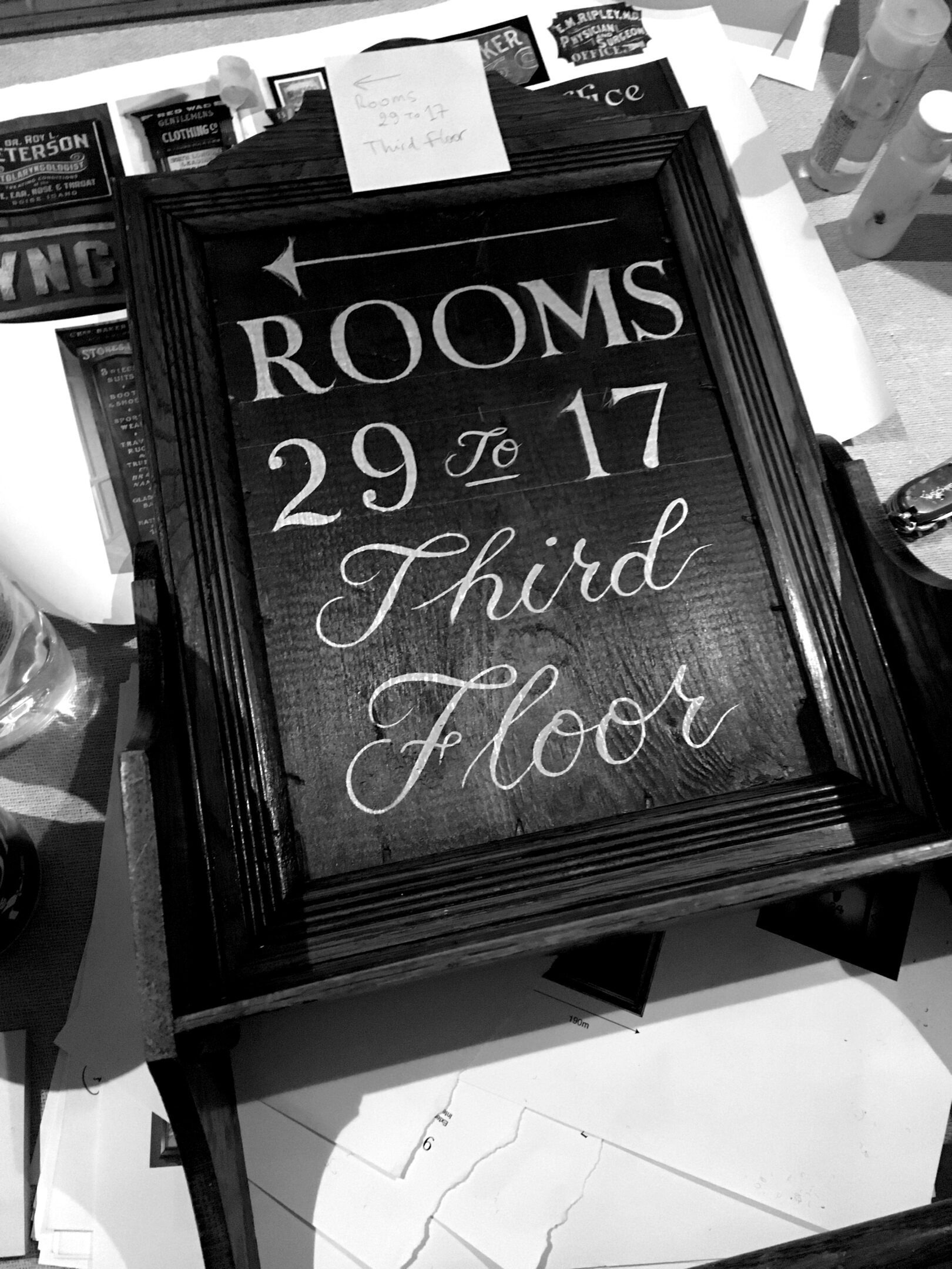
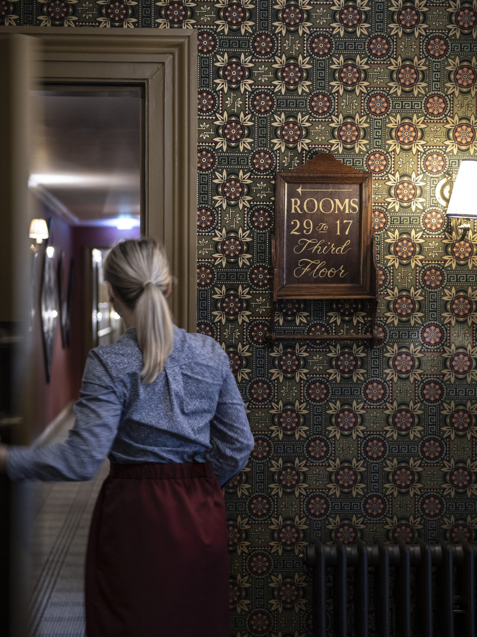
Handpainted details reflected the idiosycratic nature of the design throughout the hotel.
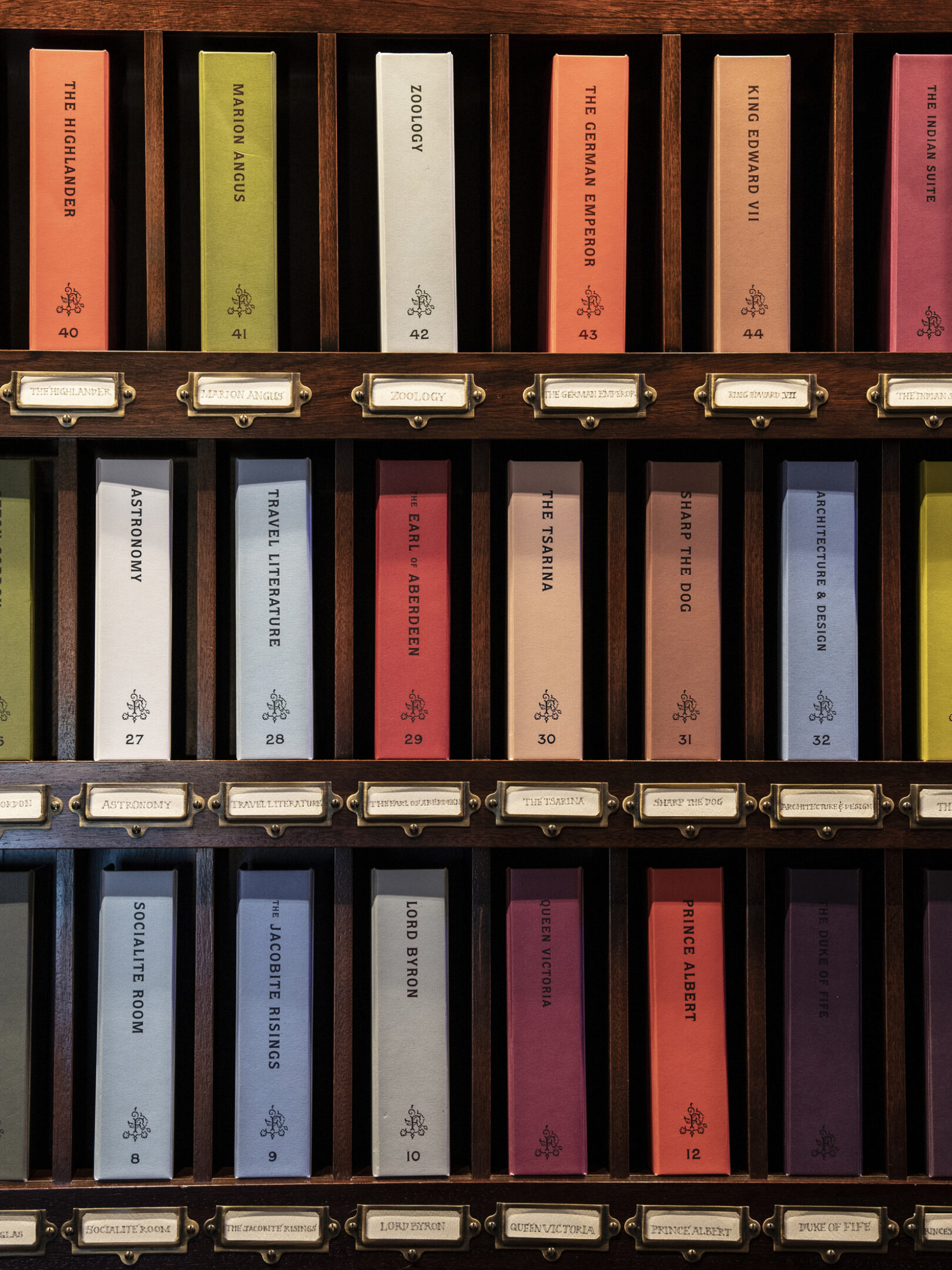
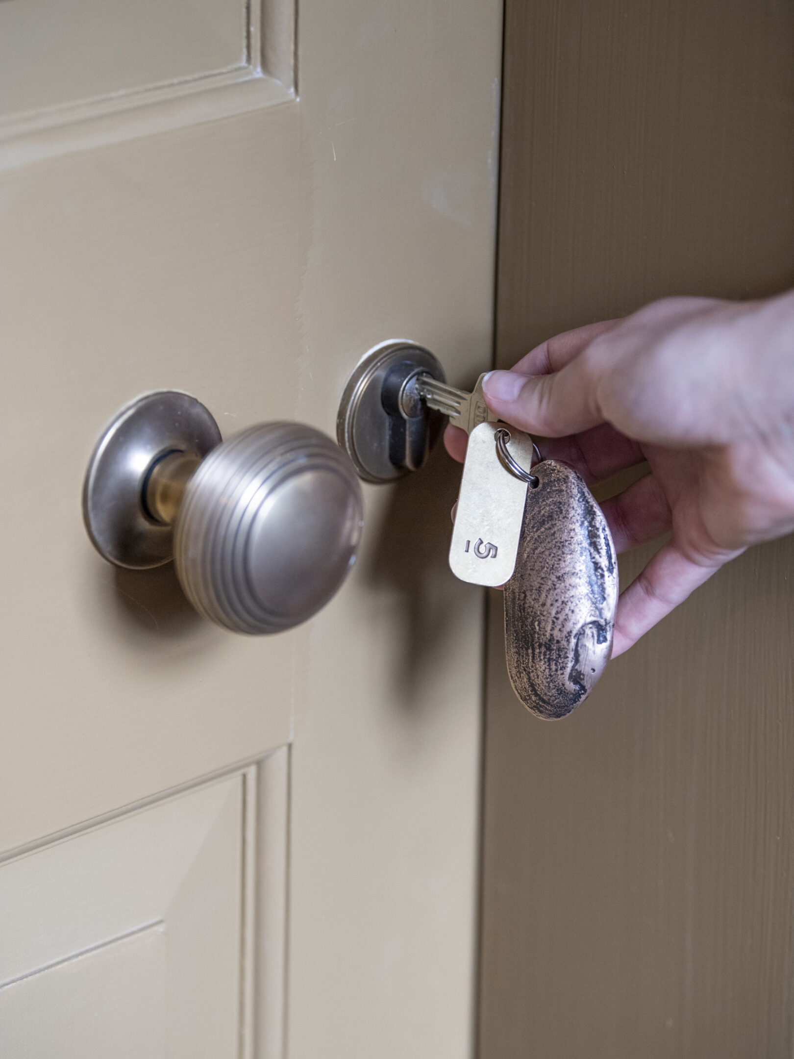
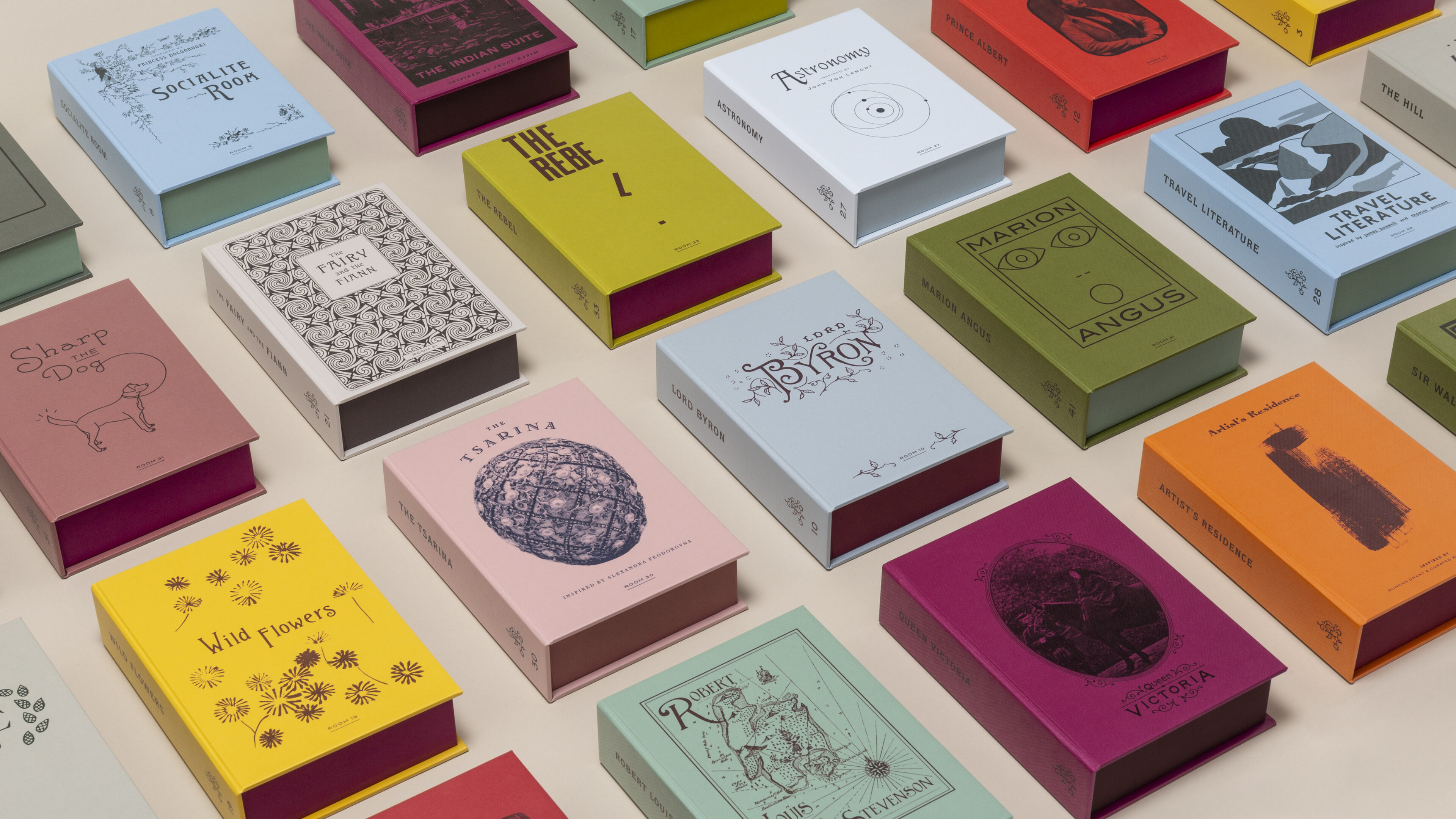
For every one of the hotel’s 46 rooms, an individual room book was created to present to every guest at check-in.
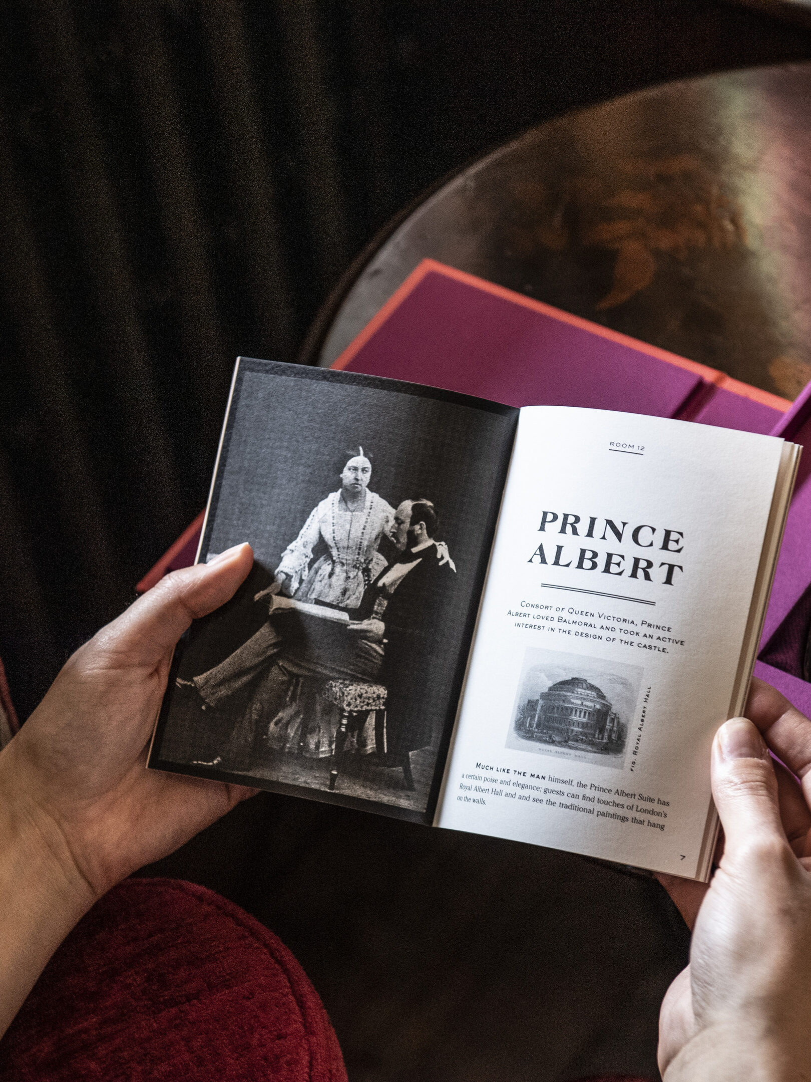
Inside each book is an individual room key, attached to a solid bronze cast of a freshwater Scottish mussel. Alongside it is a small booklet full of fables and facts that reveal more about the character of the room the guest is about to unlock.
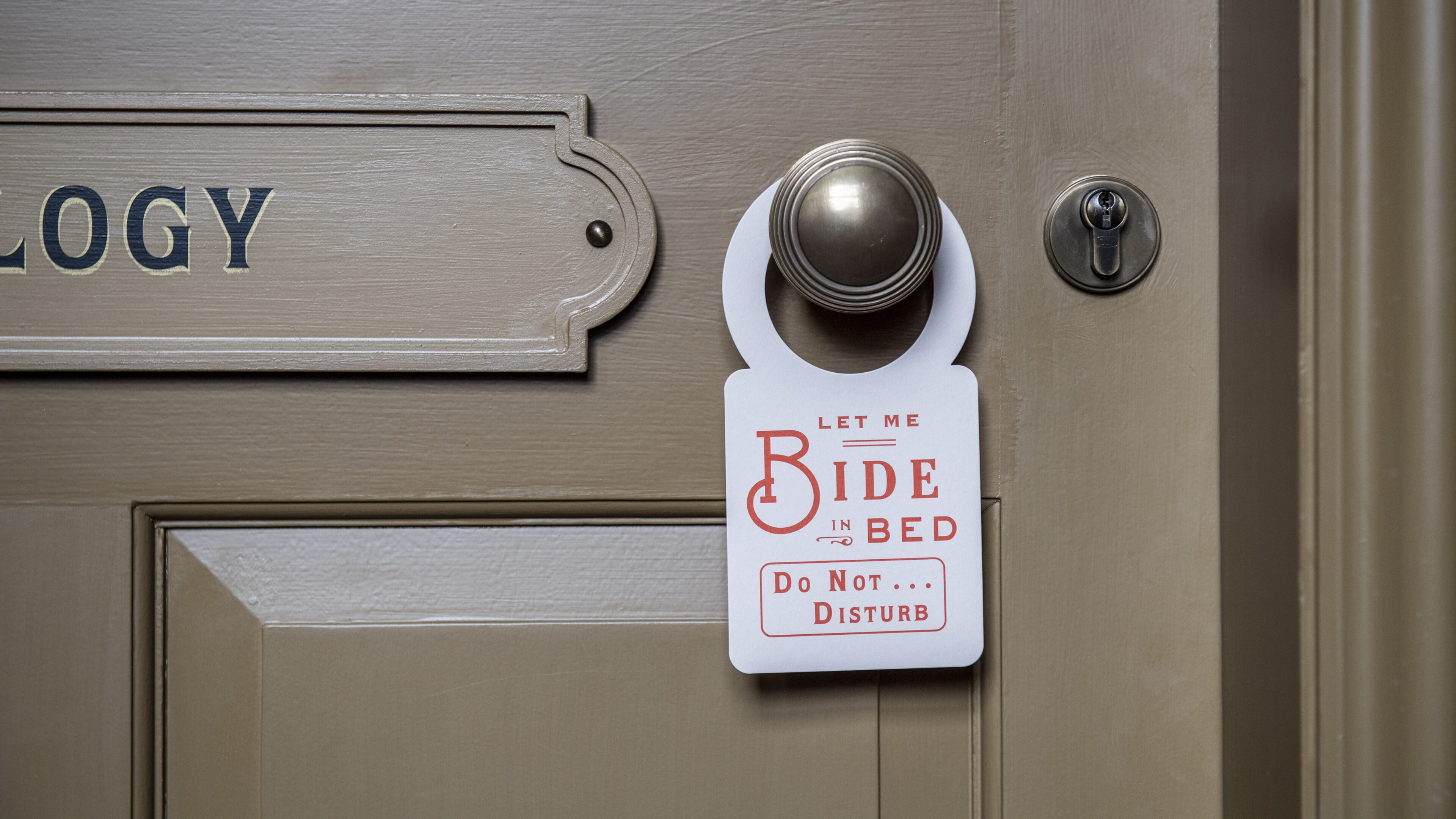
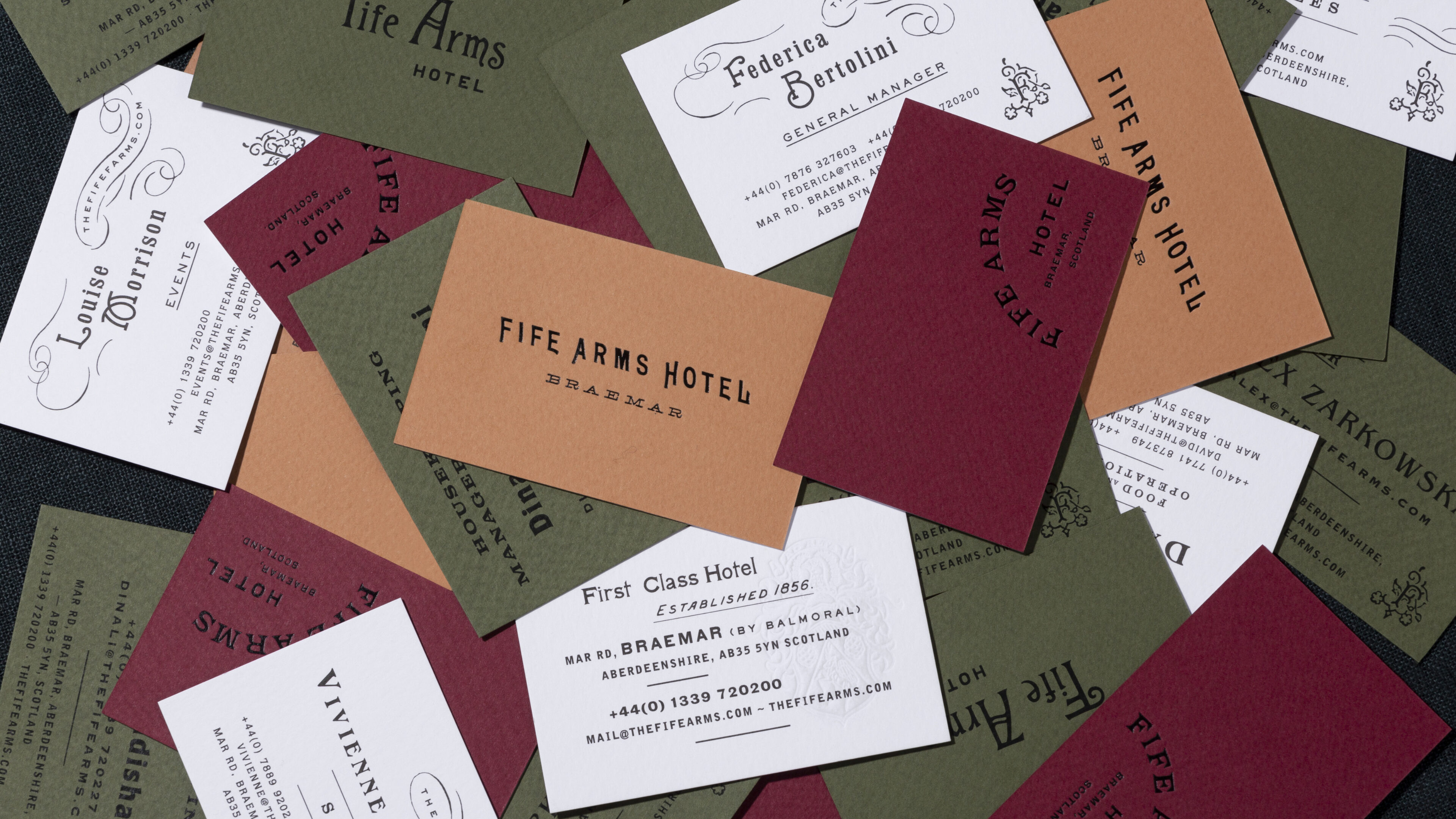

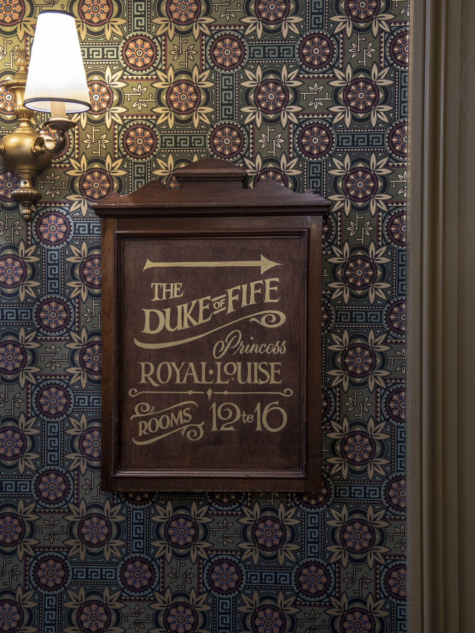
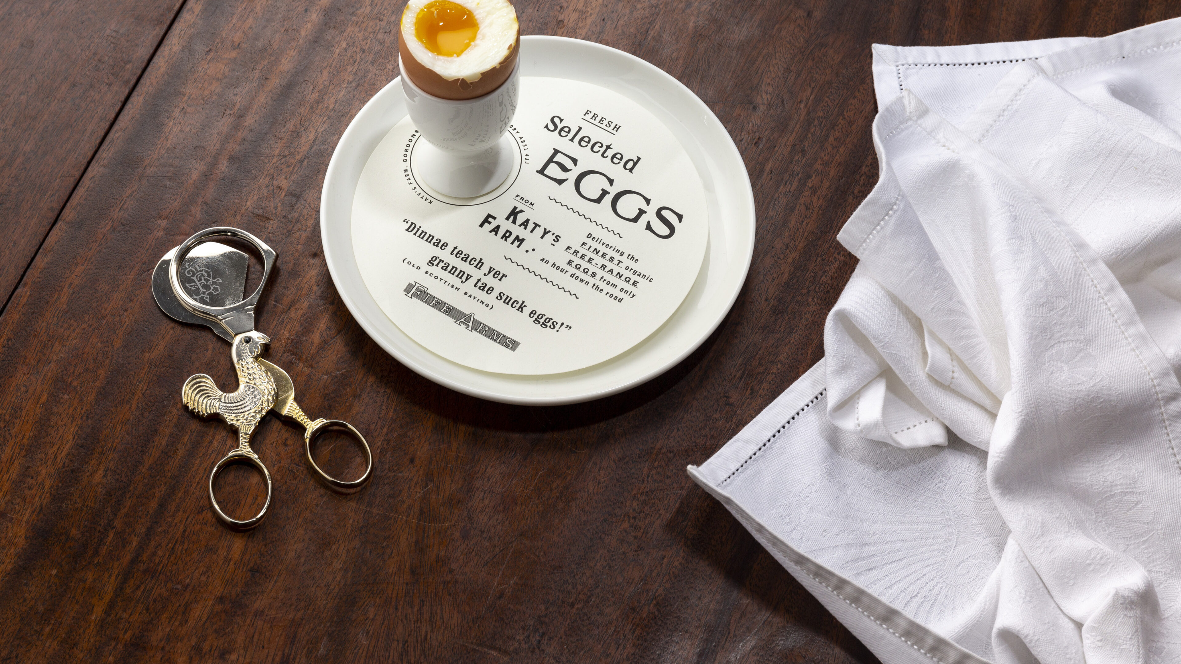
The connection to the history of the village is evident, not only in the choice of dishes, but in the richly layered presentation of everything, from the menus to the bespoke scissors used to snip the head off your hard-boiled egg.
Layer-upon-layer of storytelling. Words that live in unique room guides, on menus, on interior signs, and on crystalline bars of tablet for sale in the gift shop. Truly, where there were new designs within The Fife Arms, there were new words.
Just as the visual work began with the Braemar historical archives, writing new words also required some specialist research and correspondence to help bring the Doric dialect to life in a charmingly authentic way.
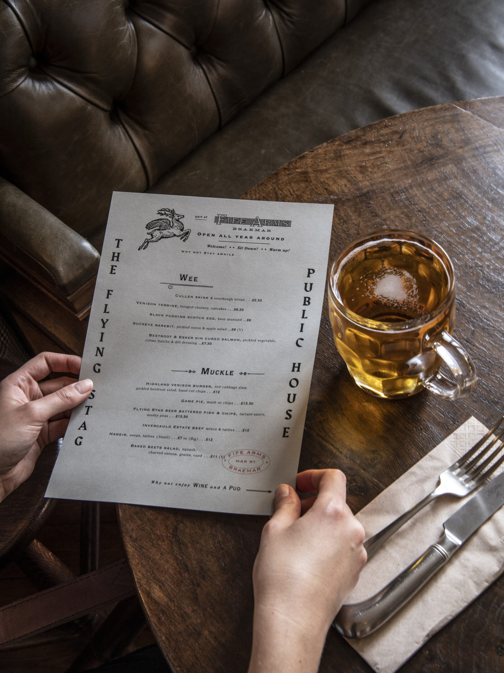
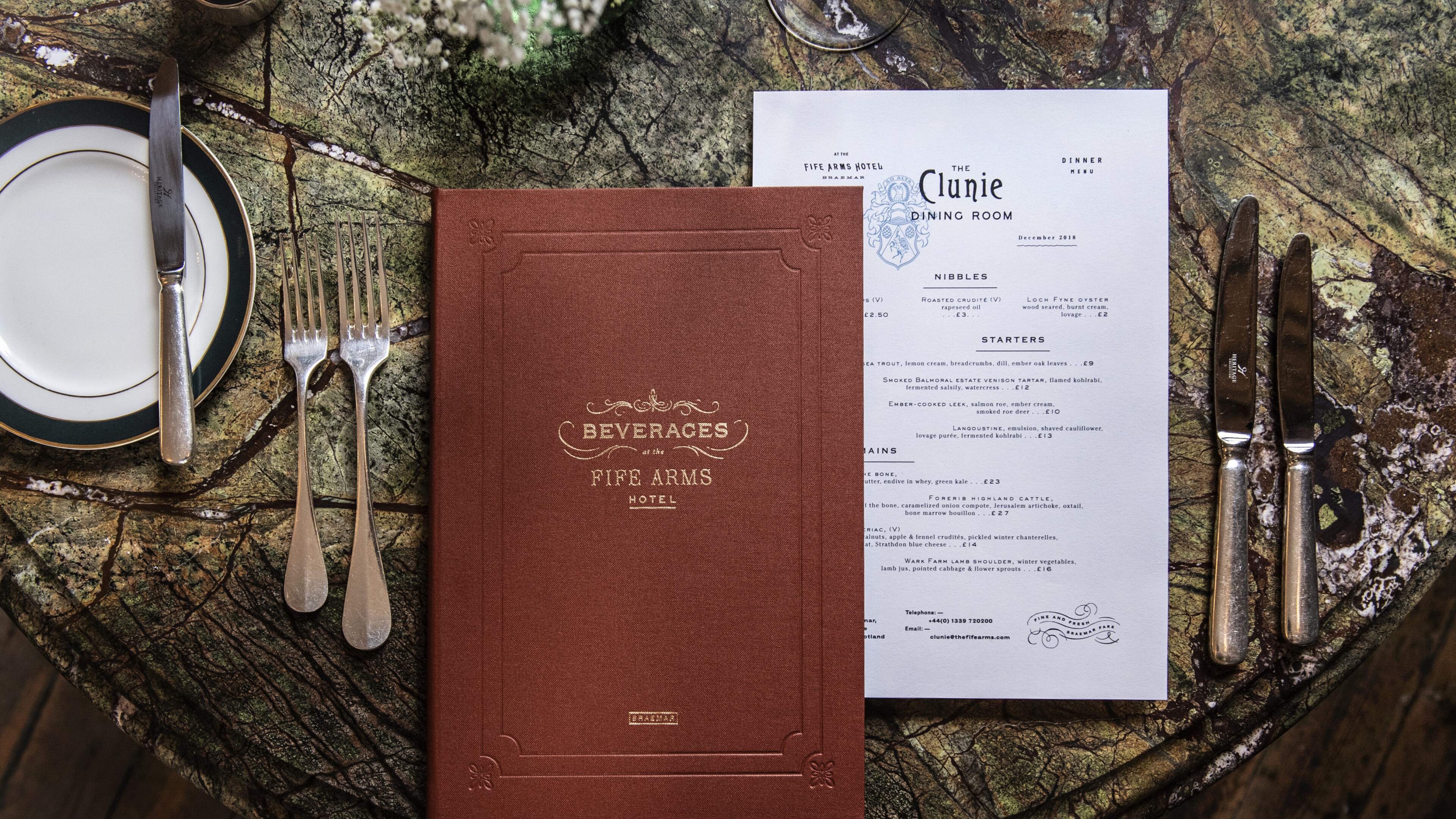
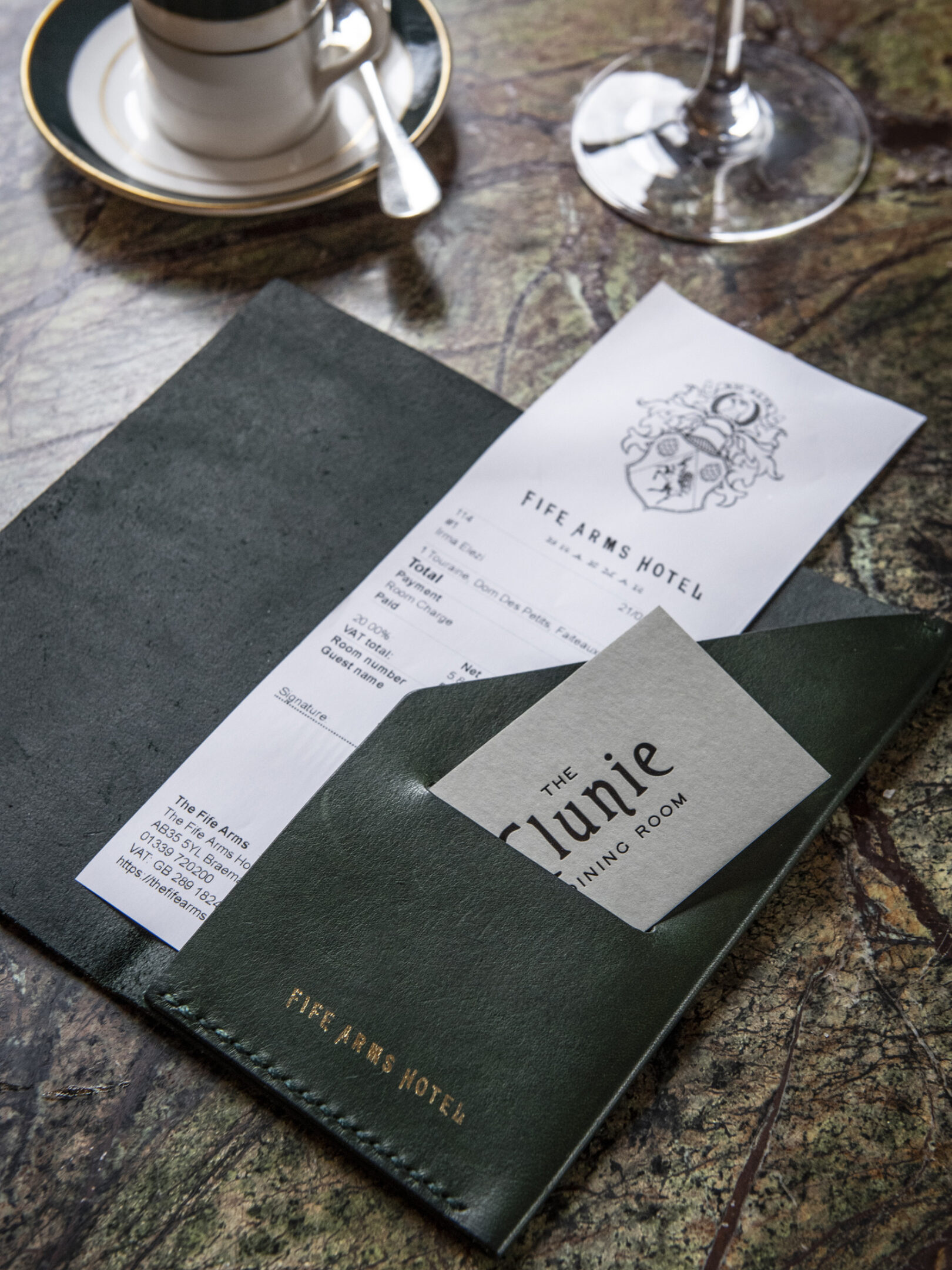
“At a time when it seems more common for new brand identities to be incredibly pared back, we veered away from neutrality to root everything we created for this project, from matchbooks to the master branding, to the charming idiosyncrasies of Braemar.”
CLIENT
Hauser & Wirth SECTOR Retail, Arts and Culture
COLLABORATORS
Adam Luszniak, photographer Sim Canetty-Clare, photographer |
RELATED WORK
The Audley & Mount St.— Revival of an old boozer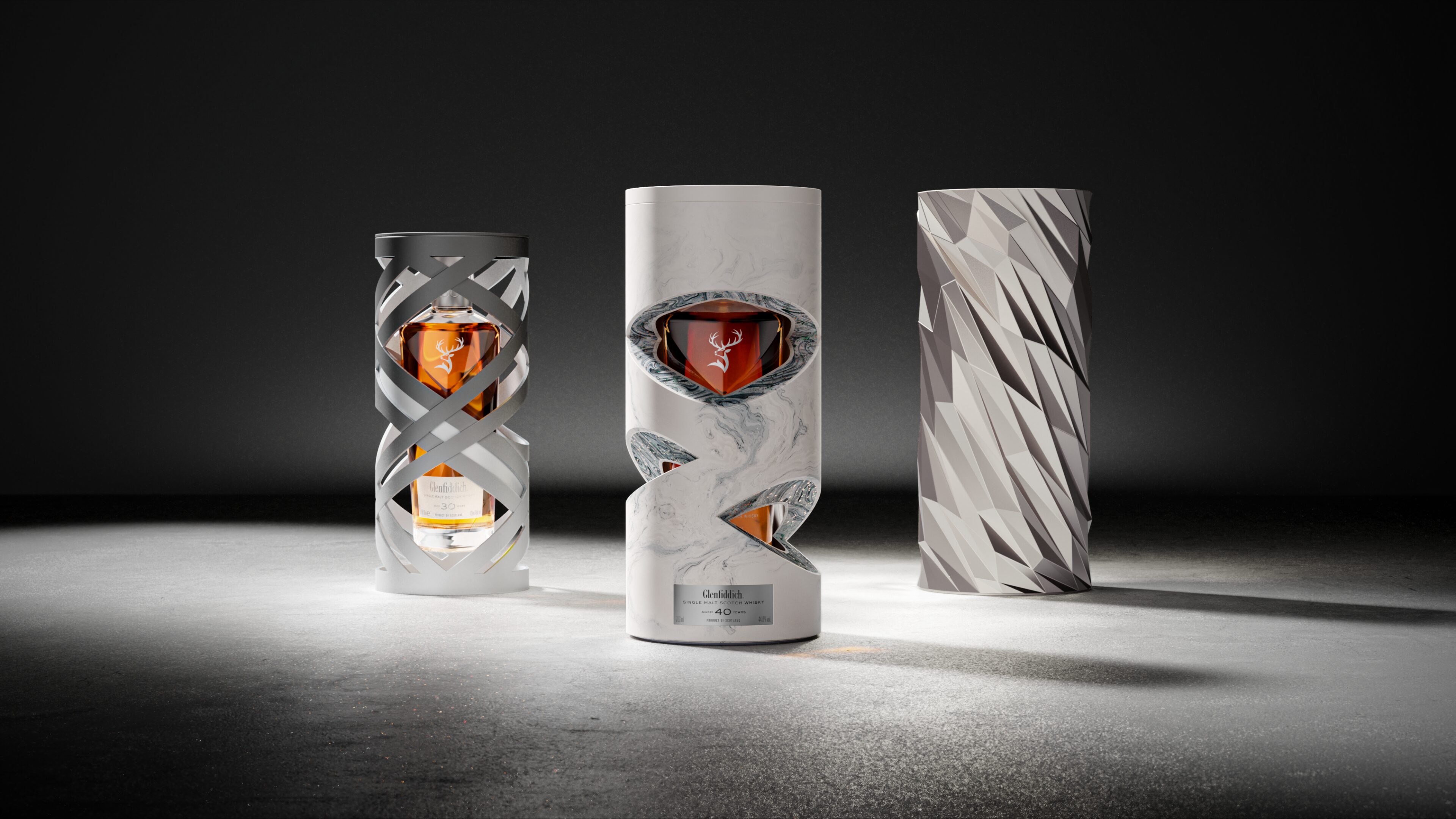
Glenfiddich— Time Re:imagined |