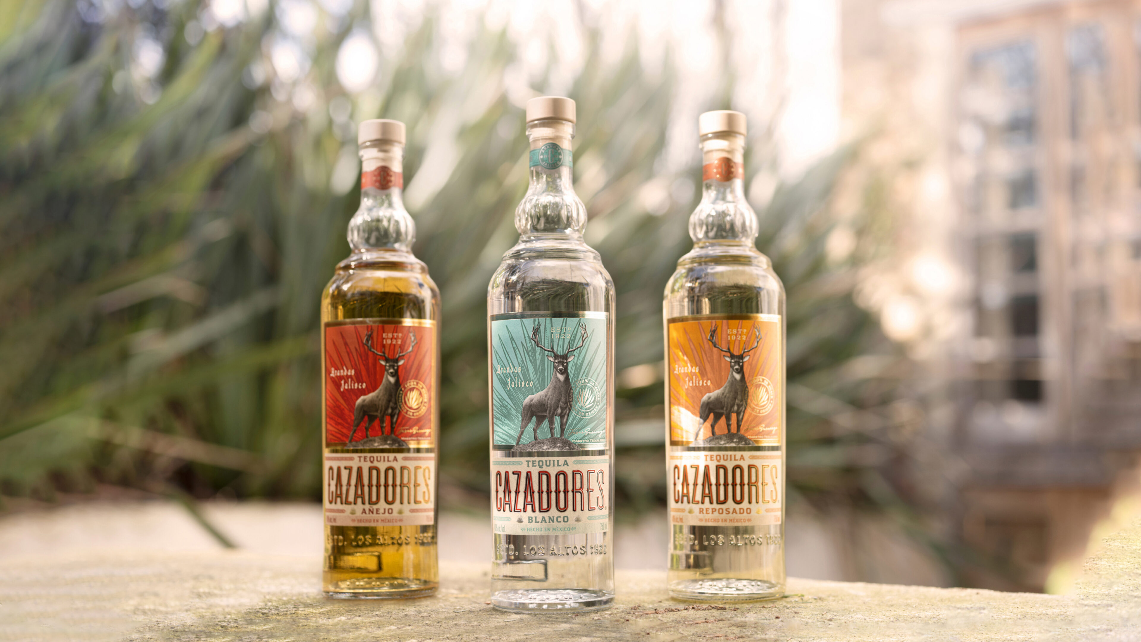
Tequila Cazadores isn’t just a tequila. It’s also the symbol for a vibrant community in Los Altos de Jalisco. Uplifting, unapologetic and growing stronger day by day. But that’s not the image Cazadores was conveying. The bottle felt outdated, a thing of the past, instead of a dynamic spirit of Mexico.
So we set out to refresh the Cazadores brand identity in a way that authentically captured their heritage while remaining contemporary. Initially rolled out on pack, the new Cazadores design stands out on shelves as a symbol of cultural pride, community spirit, Mexican heritage – and damn good tequila.
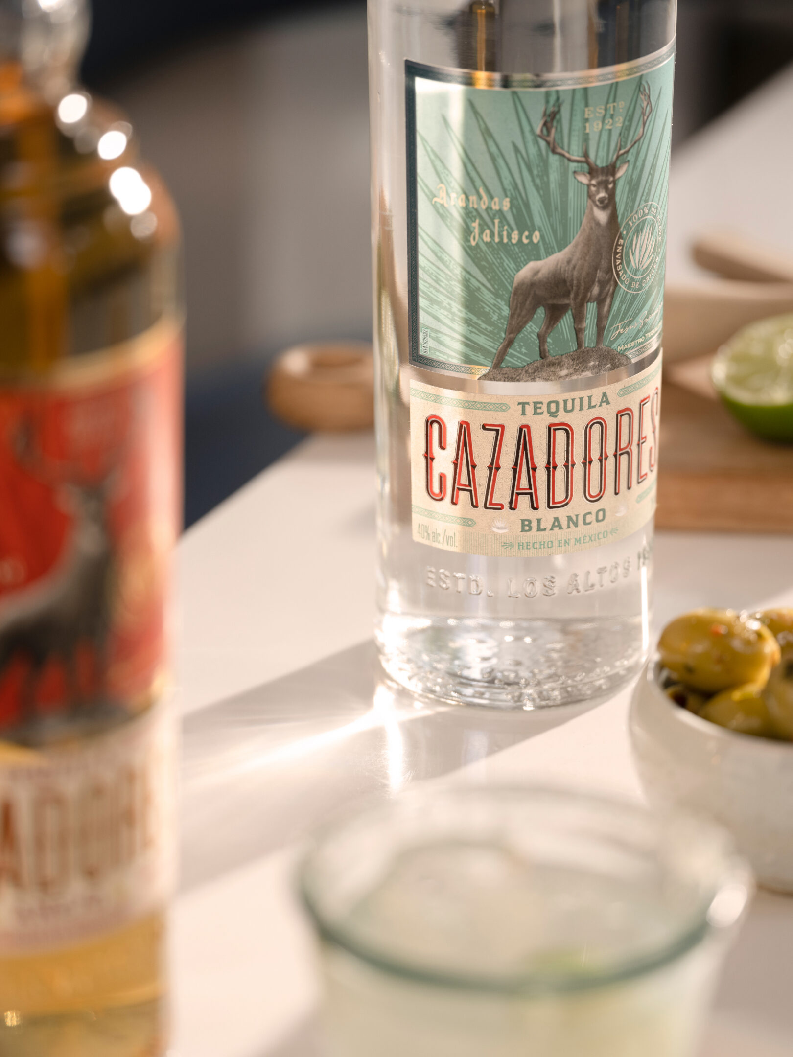
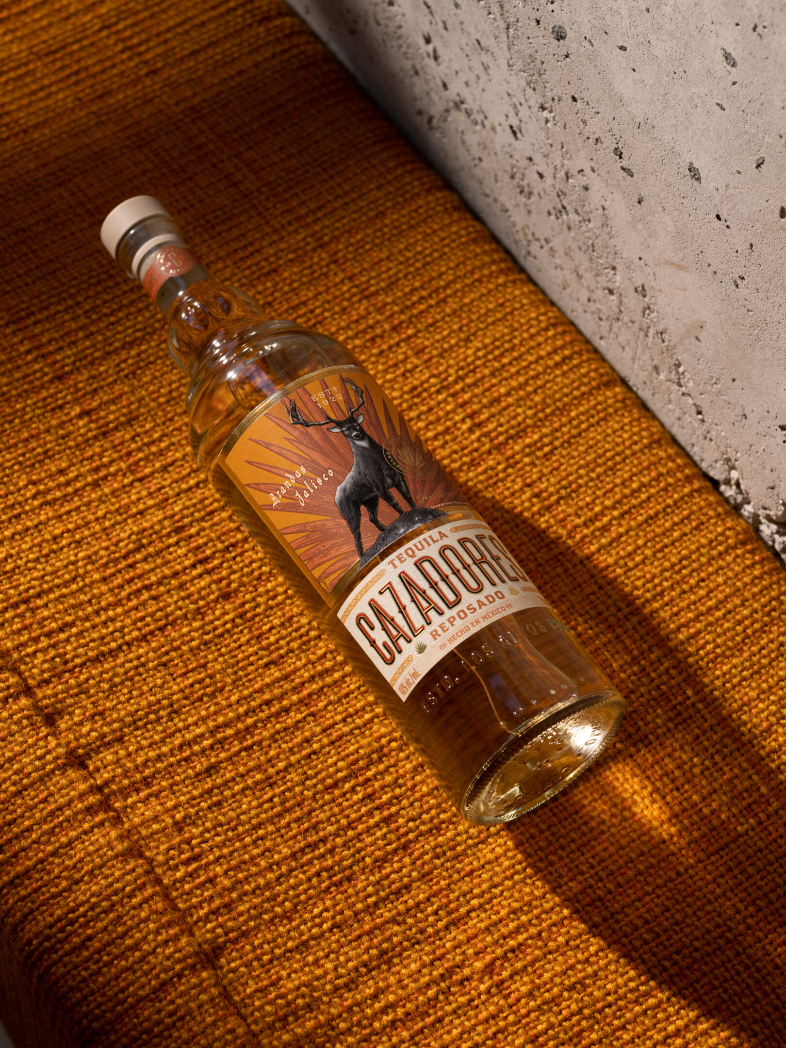

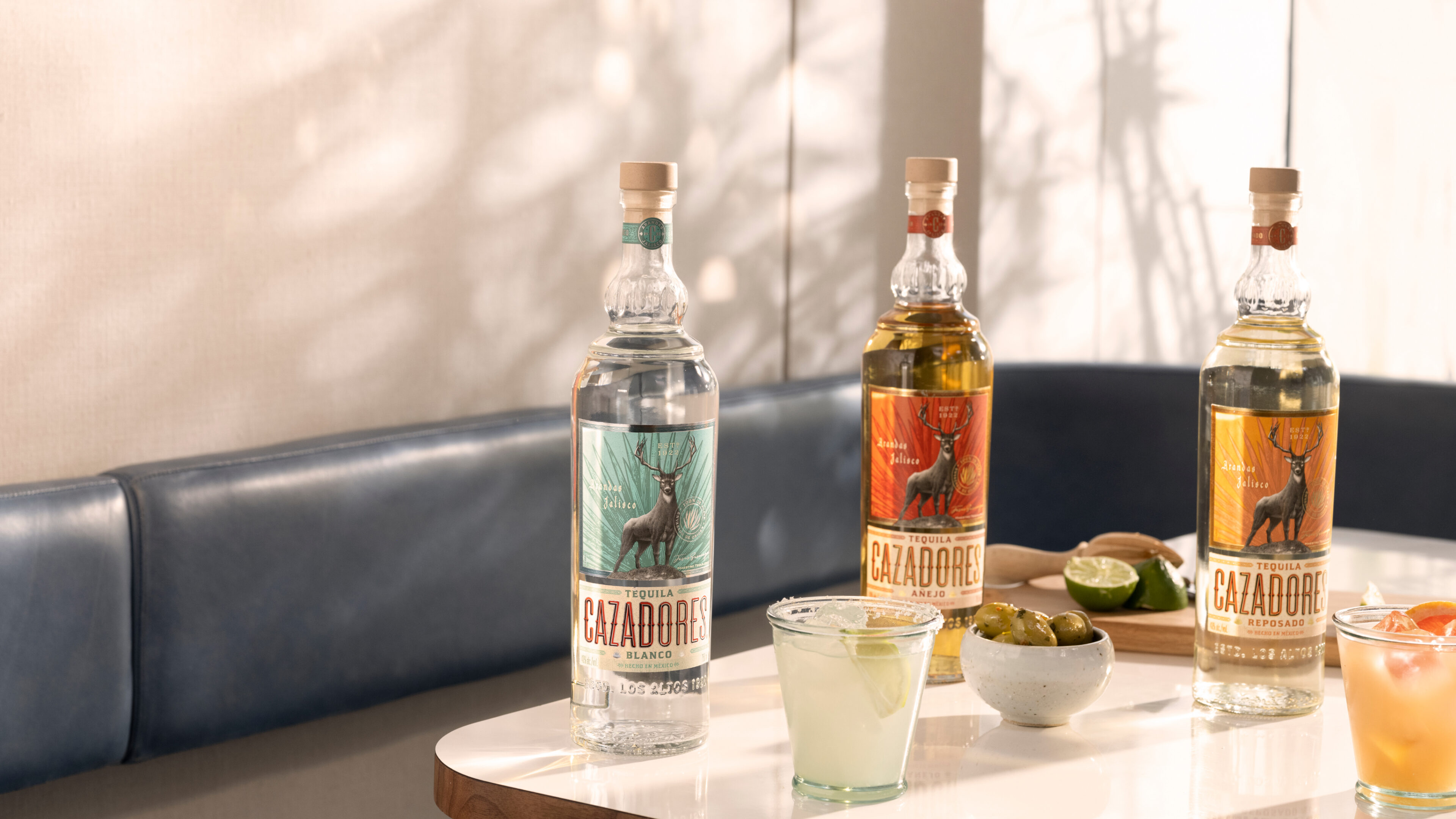
The Cazadores archives go back a century and are the wellspring of a deep-rooted and proud heritage as well as treasure trove of hidden gems. Inspired by what we found, we drew on design elements from previous bottles to create a bold yet sophisticated look. A tall stance and iconic bulbed neck pair with subtle details that speak to Mexican culture.
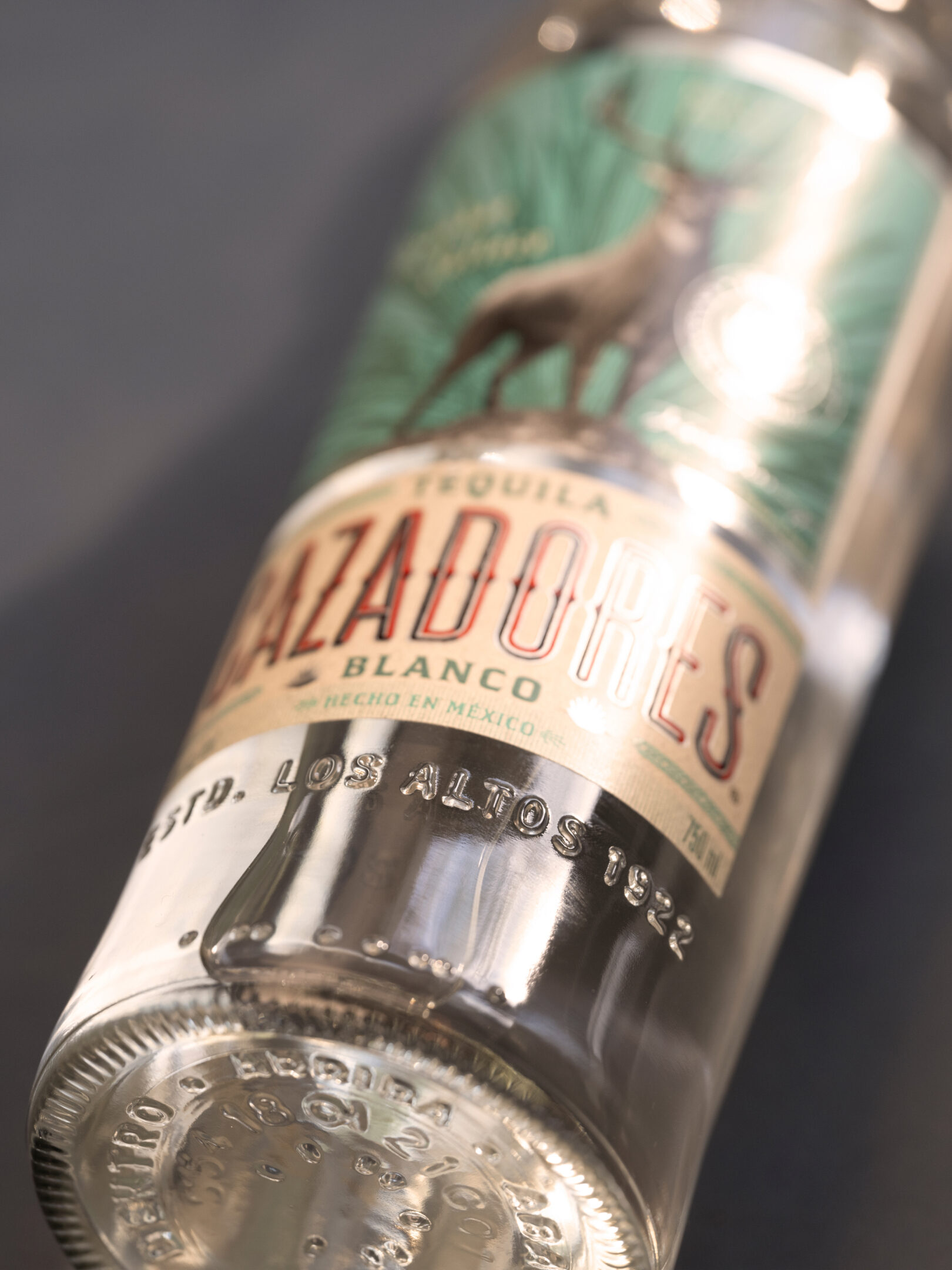
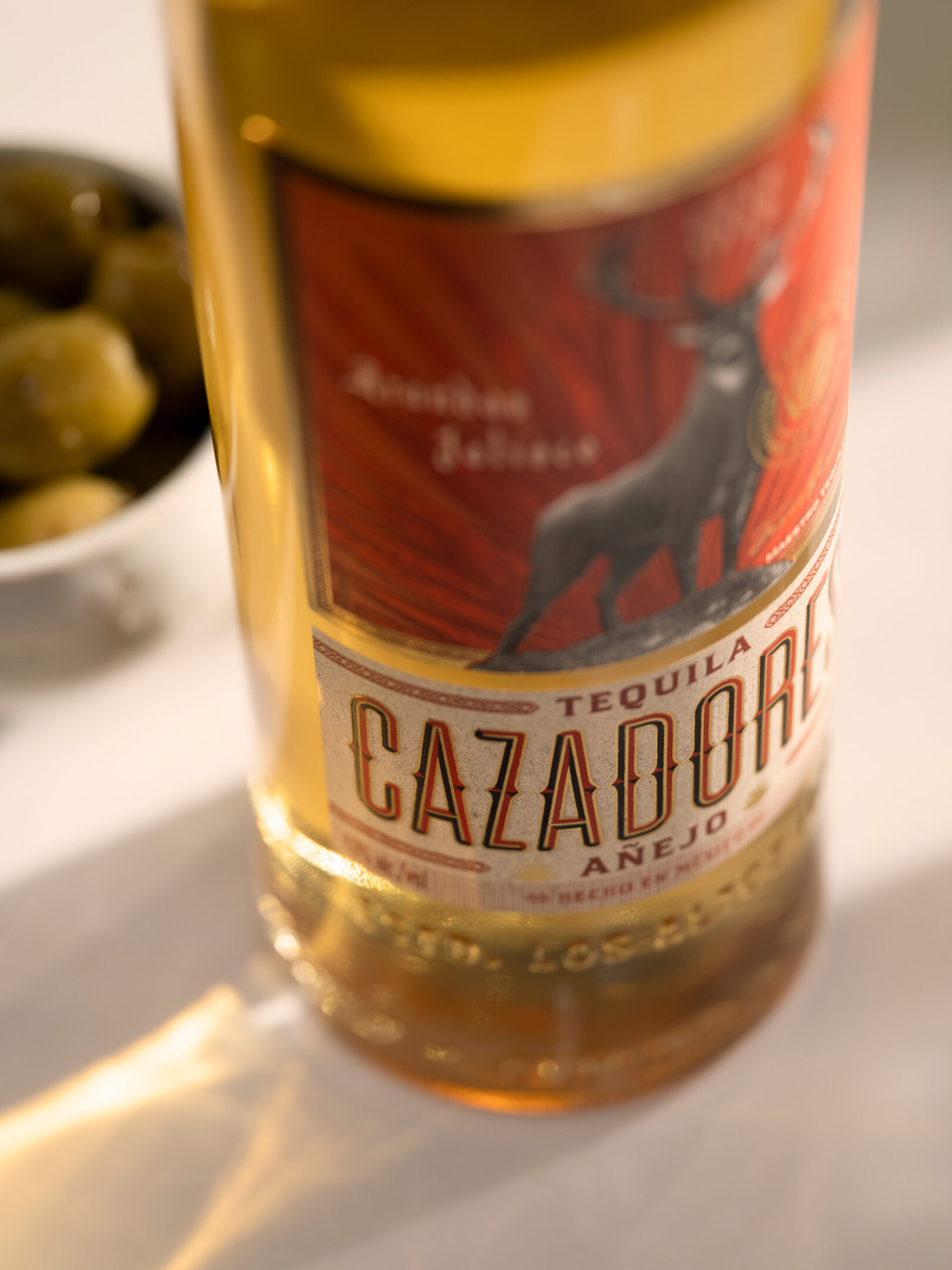
Now each bottle proudly displays origin – Estd. Los Altos 1922 – and truly embodies the concept of social enjoyment. Check the base for the words: Arriba, abajo, al centro y pa’ dentro. Salud to that!
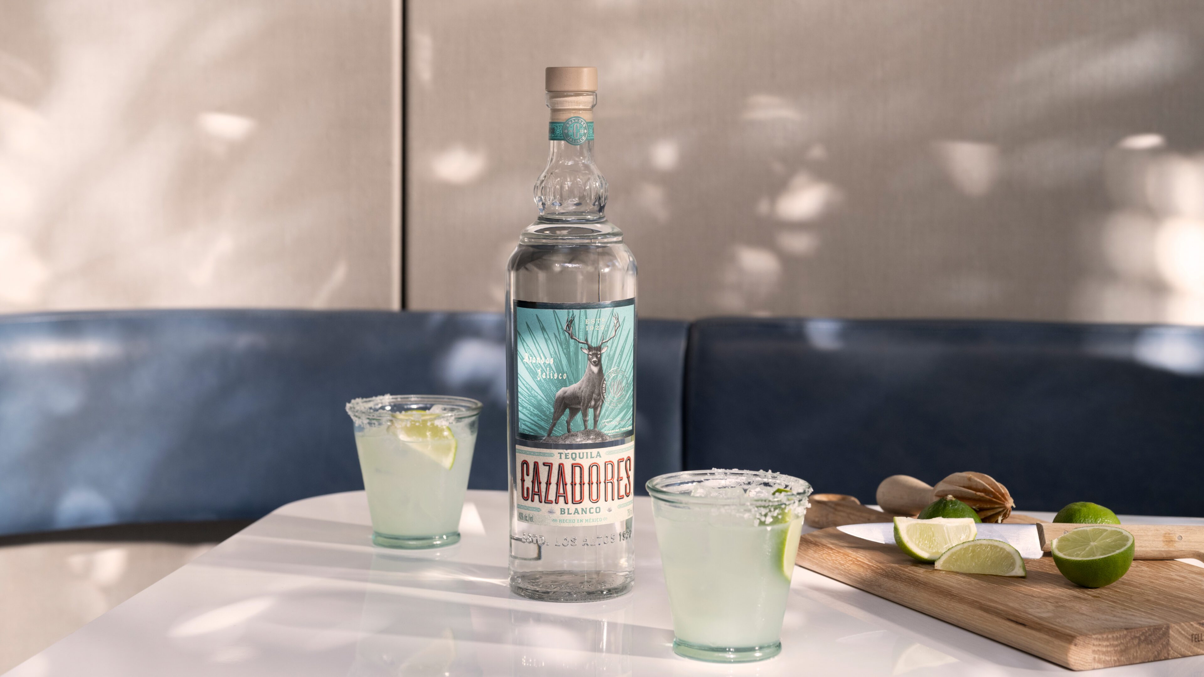
The stag is a prominent emblem of the Cazadores brand. Though loved by its people, it had lost its impact and meaning over the years. We reintegrated this beloved feature by giving it a clear narrative connected to today’s community.
CLIENT
Bacardi SECTOR Beverages |
RELATED WORK
NoMoSu— A sugar-free first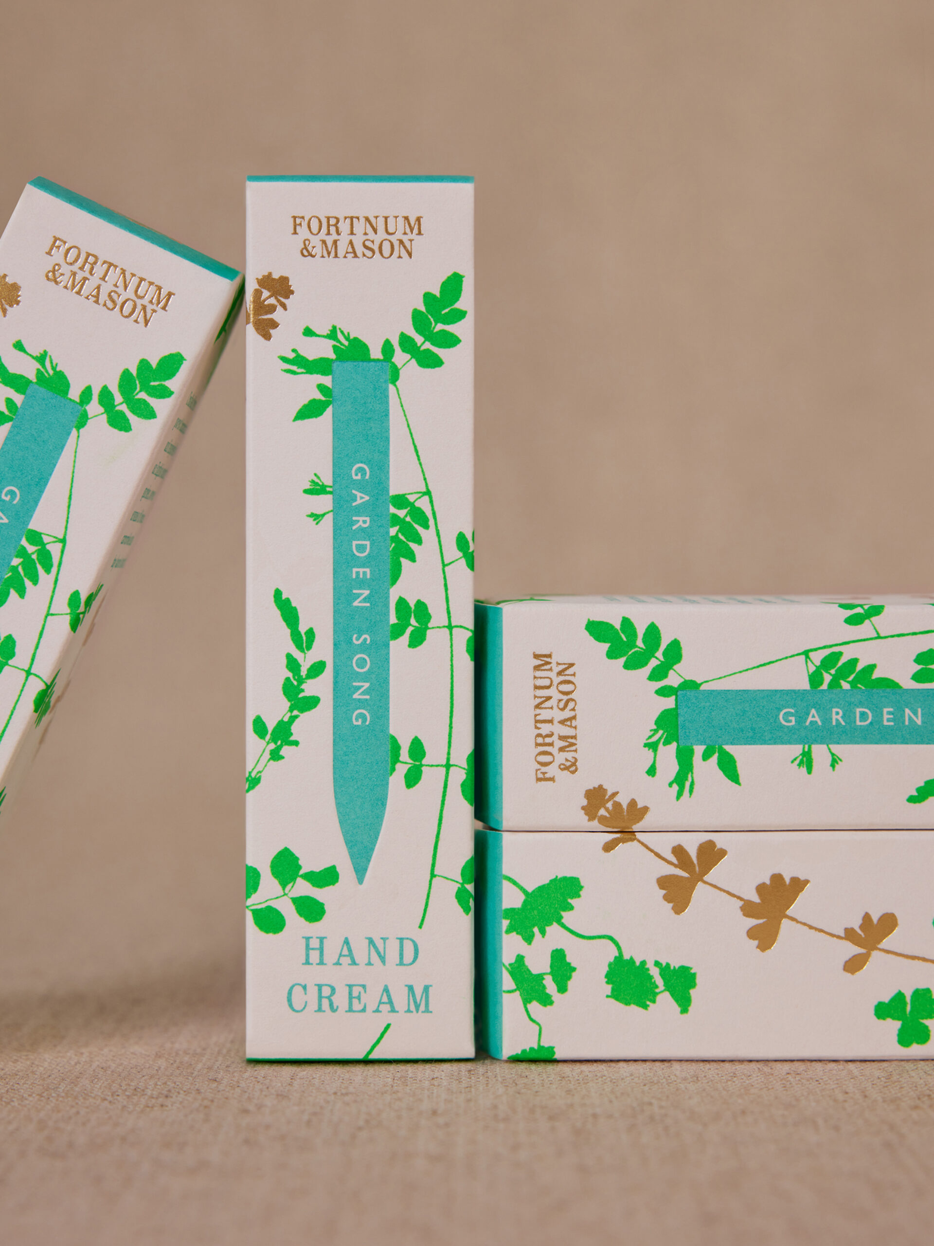
Fortnum & Mason- A Heritage Brand Blooms a Contemporary Collection |